


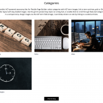
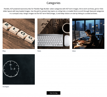
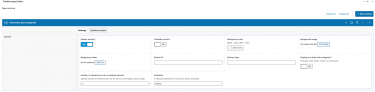
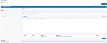
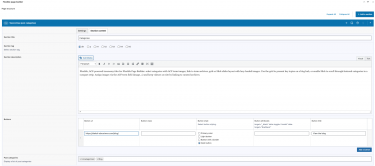
Flexible Taxonomy displays selected taxonomy terms (post categories) as linked tiles in your Flexible Page Builder layouts. Each tile shows a term image (from an ACF term field) and the term name, both linking to the term archive page. The section supports a responsive grid by column setting or an optional slider mode.
What you can show in the block
- Selected terms (e.g., WordPress categories), ordered as chosen in the editor.
- Term image pulled from the ACF term field
image_1(per term), rendered responsively.Term title displayed as a clickable heading linking to the term archive.
Layout and presentation
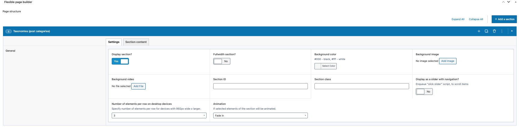
- Grid mode: responsive columns controlled by the section’s item class (e.g., 1, 2, 3, 4, 5, 6, or 12 items per row at desktop breakpoints).
- Slider mode: enabling the section’s Slick option items become slides.
- Performance: images are rendered via the plugin’s helper as responsive
<picture>with lazy loading. - Animation: optional animation classes can be applied to each tile via the section’s animation setting.
Editor experience
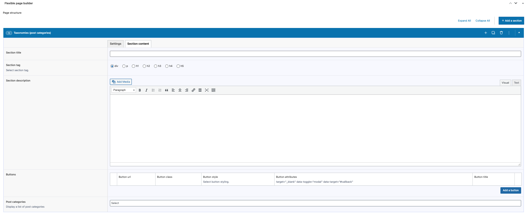
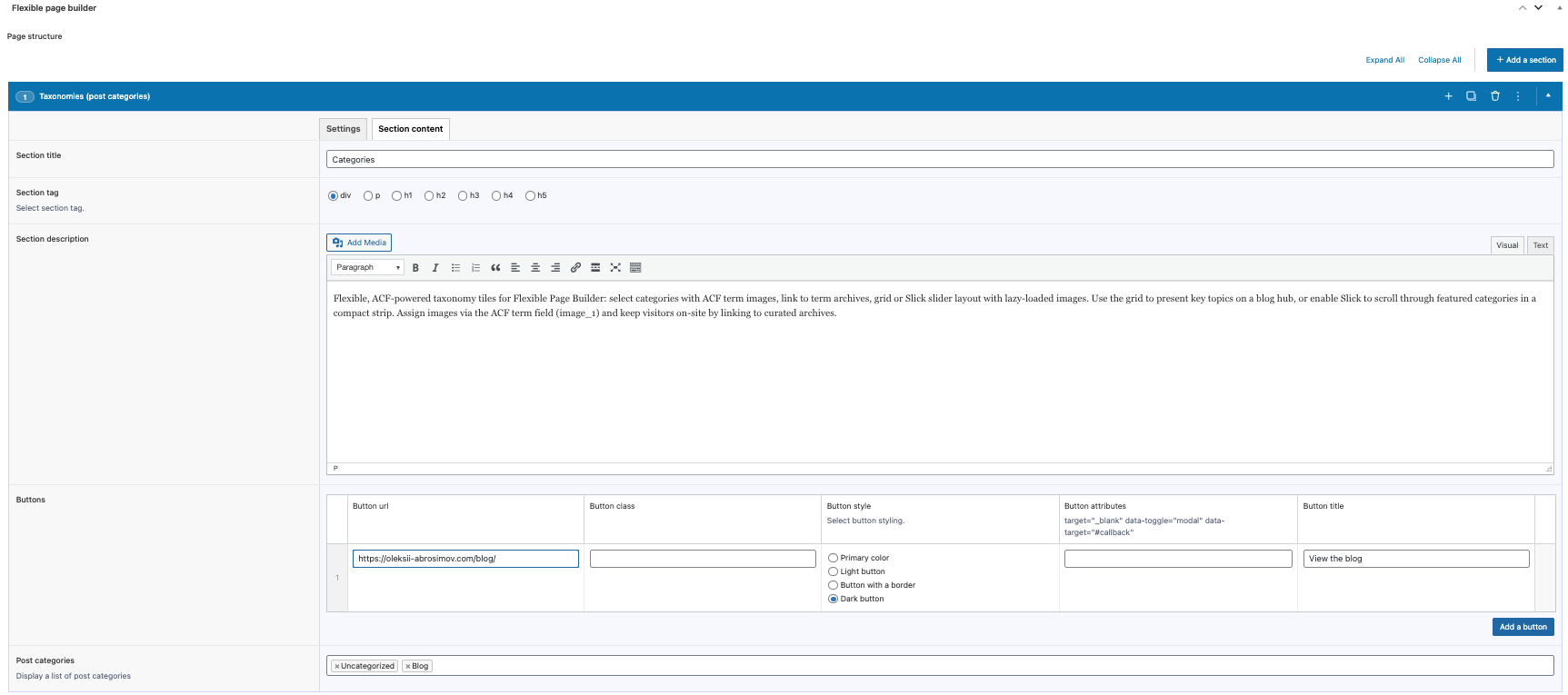
- Select taxonomy terms via ACF (module currently queries the category taxonomy and keeps your selected order).
- Choose grid columns number through the section’s item class; toggle slider mode with the section’s Slick setting.
Compatibility and requirements
- Term images come from ACF term meta (
image_1); ensure those fields are available on the used taxonomy (note: you need to create “image_1” field for the taxonomy).
Typical use cases
- Category tiles on a blog homepage.
- Quick navigation to key topics or collections.
- Landing pages featuring highlighted categories with images.