

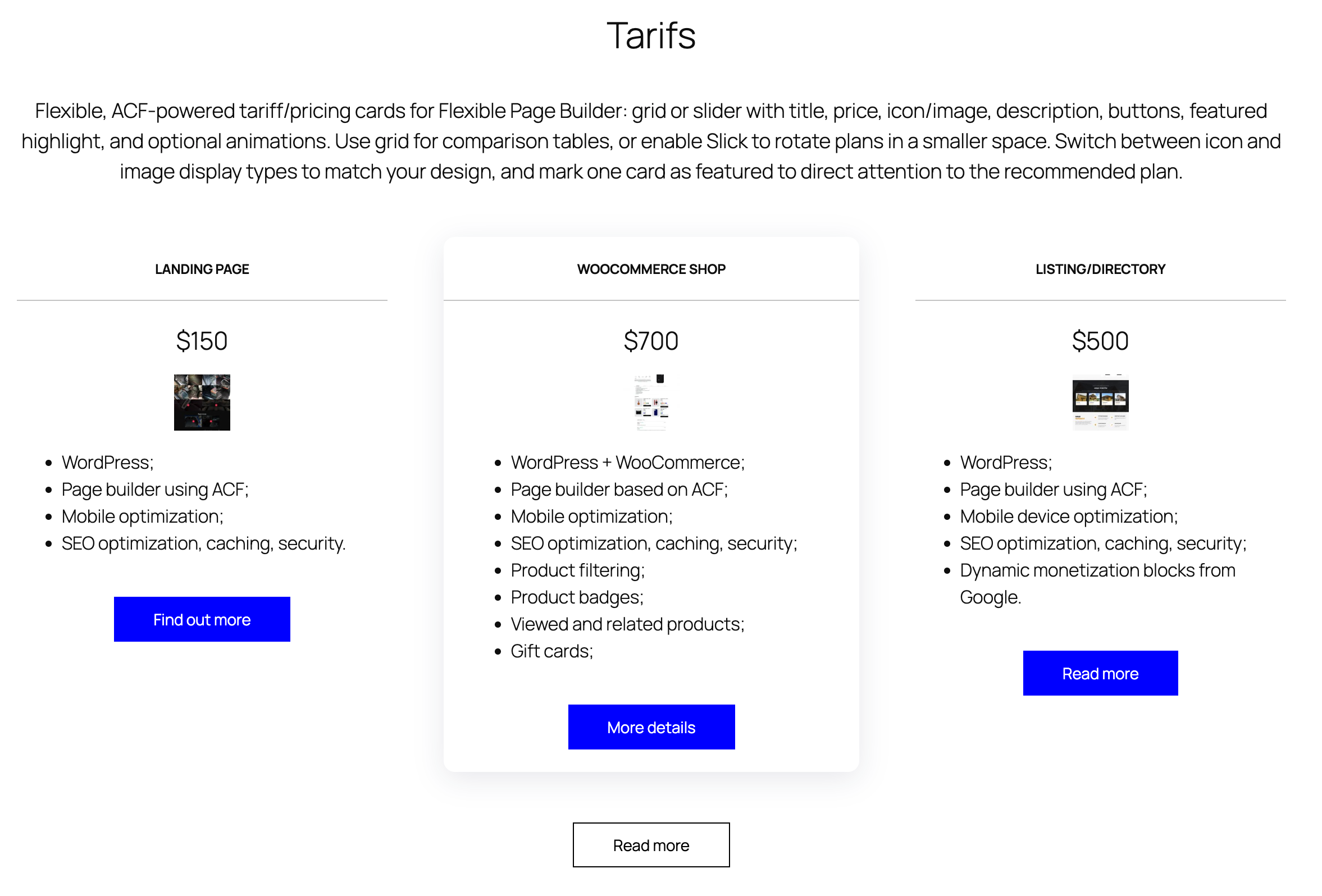
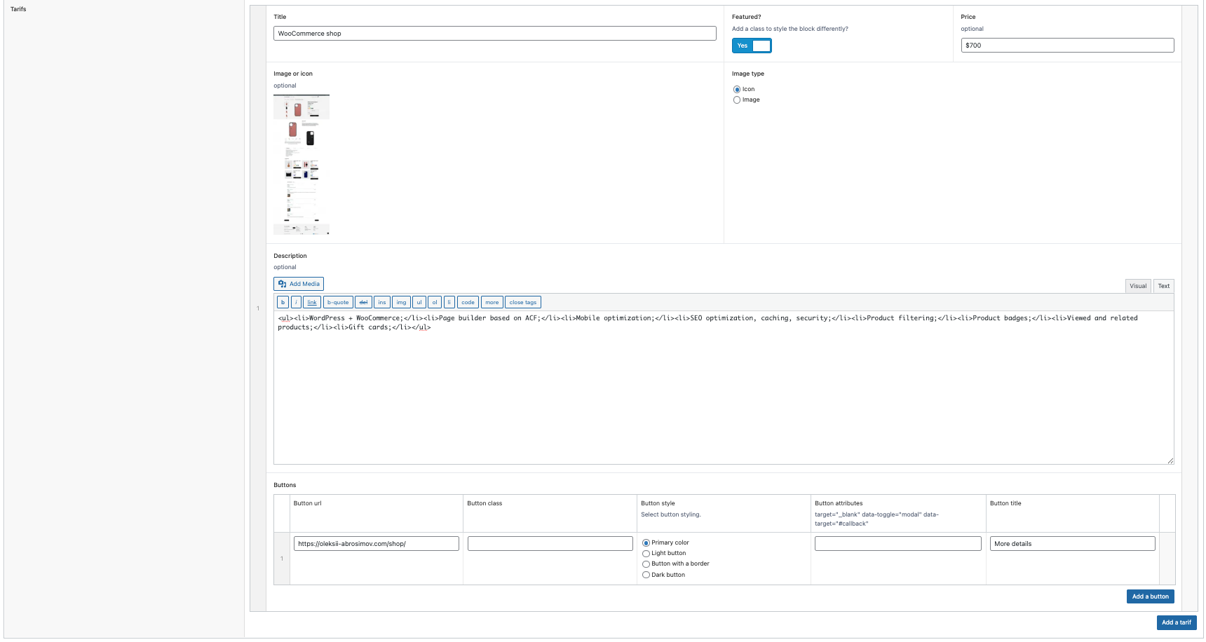
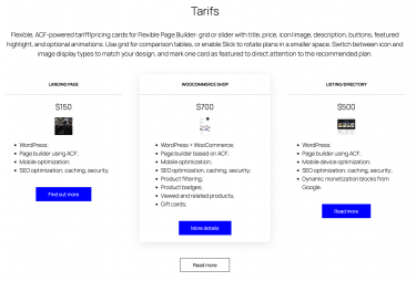
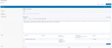
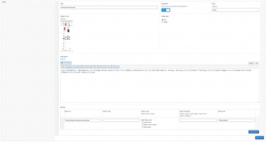
Flexible Tarifs lets you build responsive pricing/tariff cards inside your Flexible Page Builder layouts. Each card can include a title, price, an icon/image (with icon vs image display modes), a description, and one or more buttons. You can mark any card as featured (adds a class) and switch between grid and slider layouts depending on the section settings.
What you can show in the block
- Title of the tariff/plan.
- Price (free text: supports any currency symbol and format).
- Icon/Image with two display types.
- Description (rich text) for features/notes.
- Buttons rendered via the shared button template.
Layout and presentation
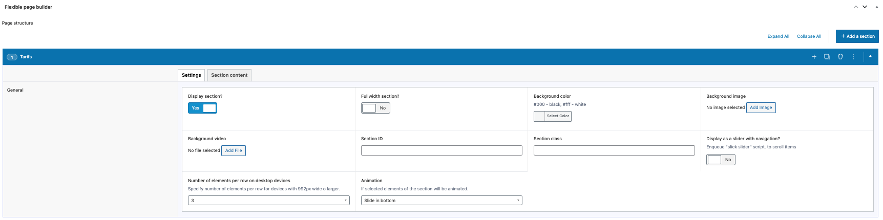
- Grid mode: responsive columns (e.g.,
col-12 col-sm-6 col-md-4) with an optional per‑section item class to control density. - Slider mode: enabling the section’s Slick option cards become slides.
- Featured state: a featured toggle adds a
featuredclass to the card wrapper for special styling. - Performance: icons/images are output via responsive
<picture>with lazy loading. - Animation: optional animation classes can be applied to each card via the section’s animation setting.
Editor experience
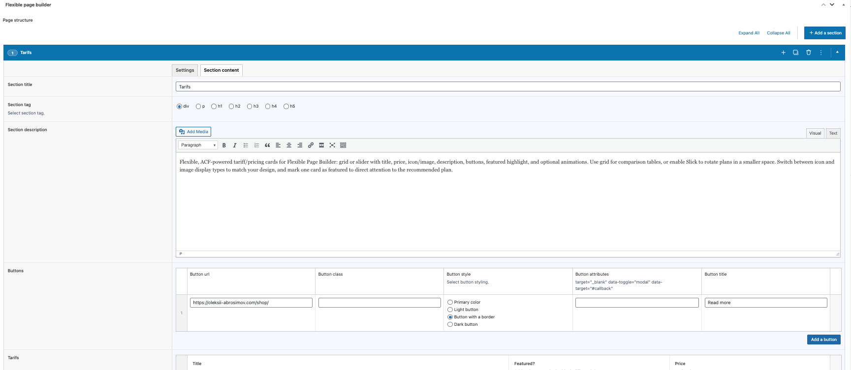
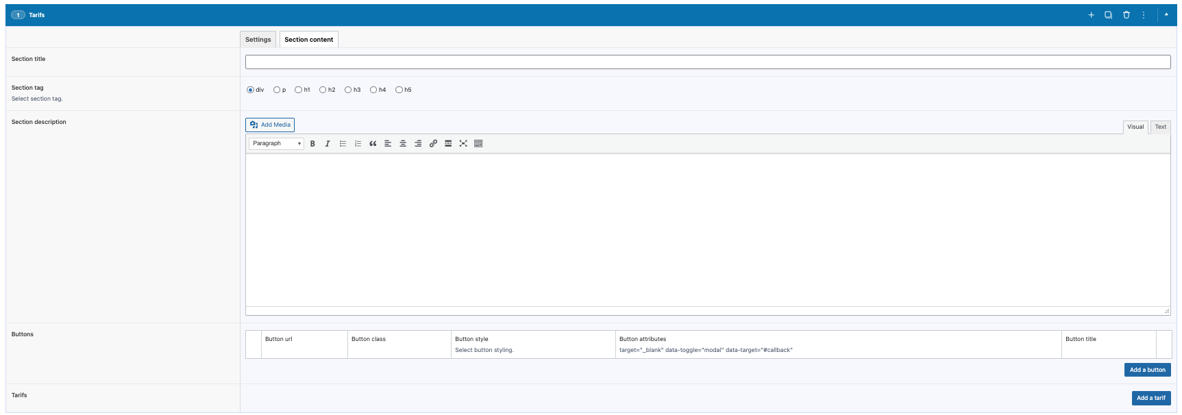
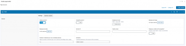
- Manage cards via an ACF repeater: upload icon/image, choose icon vs image type, set title, price, description, buttons, and featured flag.
- Reorder with drag‑and‑drop; add or remove tariffs without coding.
- Switch between grid and slider by toggling the section’s Slick setting; adjust columns with the item class option.
What this module does not do (by design)
- Does not calculate totals, discounts, or taxes – prices are displayed exactly as entered.
- Does not implement checkout; use buttons to link to relevant pages or actions.
- Does not auto‑generate features lists; include any details within the description.
Typical use cases
- Plan/pack pricing grids with a highlighted (featured) plan.
- Service tiers with iconography and action buttons.
- Promo pricing sliders on landing pages.