

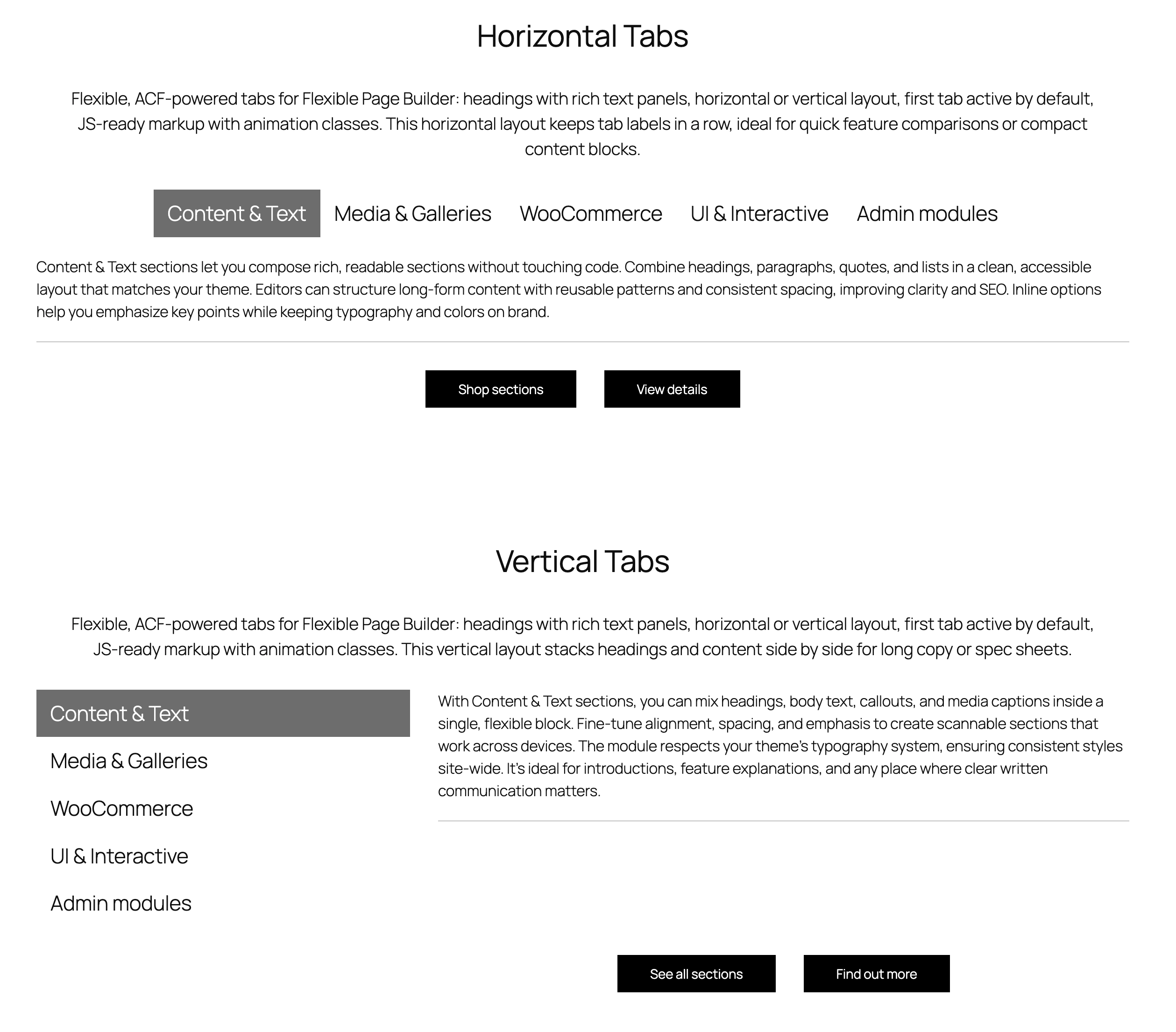
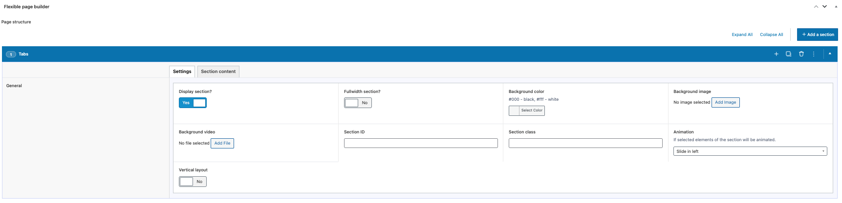
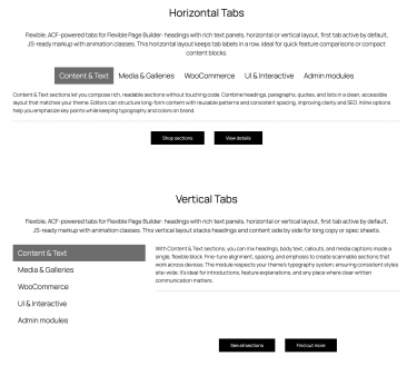
Flexible Tabs outputs a clean tabbed content interface in your Flexible Page Builder layouts. Each tab has a heading and a corresponding content panel that supports rich text/HTML. The first tab is active by default. A vertical layout can be enabled via a section setting that adds an is_vertical class to the wrapper.
What you can show in the block
- Tab headings (one per item) displayed in a horizontal scrollable row by default; the first tab is marked active.
- Tab content areas (rich text) mapped 1:1 to headings.
Layout and presentation
- Orientation: default horizontal; add the
is_verticalclass (via the module setting) to switch to a vertical layout. - Active state: both heading and corresponding content get an
activeclass for the visible tab. - Animation: optional animation classes can be applied to headings and content wrappers using the section animation setting.
- Accessibility hooks: headings and content are paired via matching
data-tabidattributes to support JS toggling.
Editor experience
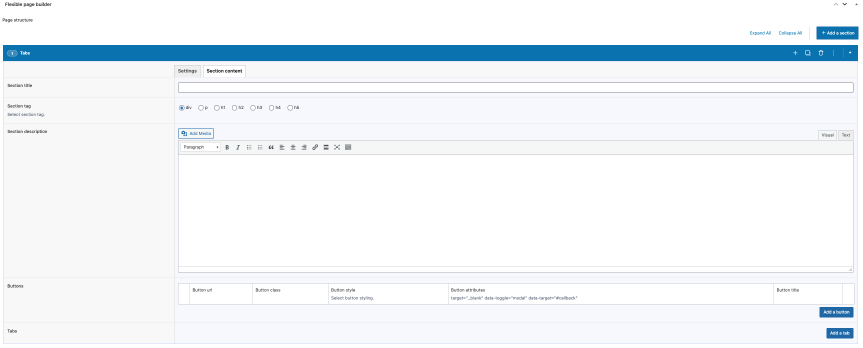
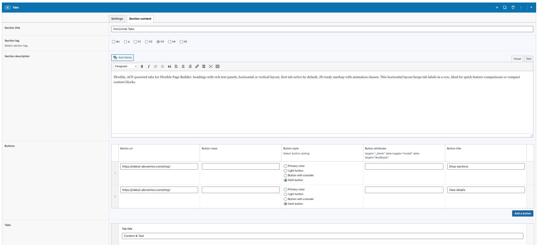
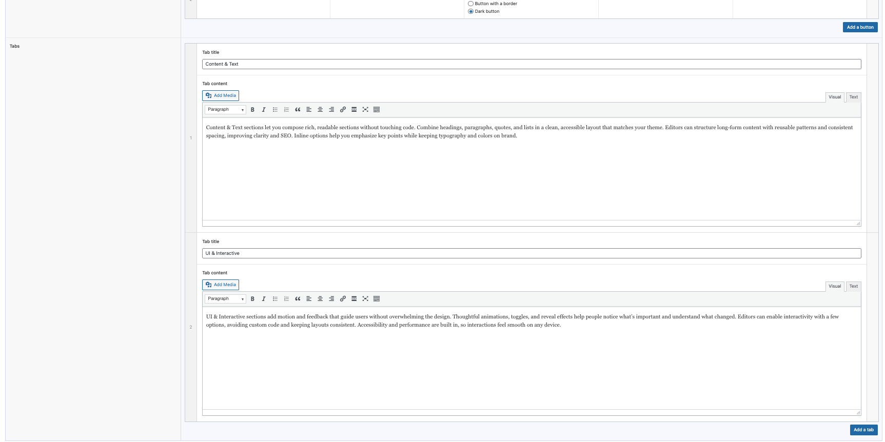
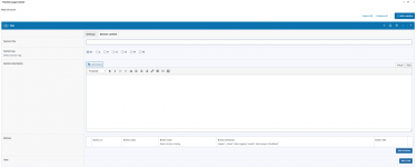
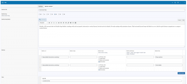
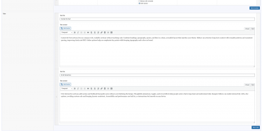
- Manage tabs via an ACF repeater: enter a heading and rich text for each tab.
- Reorder tabs with drag‑and‑drop; add or remove tabs without coding.
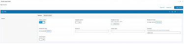
- Toggle vertical layout in the section options as needed.
What this module does not do (by design)
- Does not include built‑in JavaScript for the tab switching – it outputs semantic, JS‑ready markup.
- Does not add ARIA roles/attributes by default; you can extend markup if you need enhanced accessibility semantics.
Typical use cases
- Feature comparisons or segmented information in a compact area.
- Policy sections grouped by topic.
- Product details split into tabs like Overview, Specs, and Warranty.