

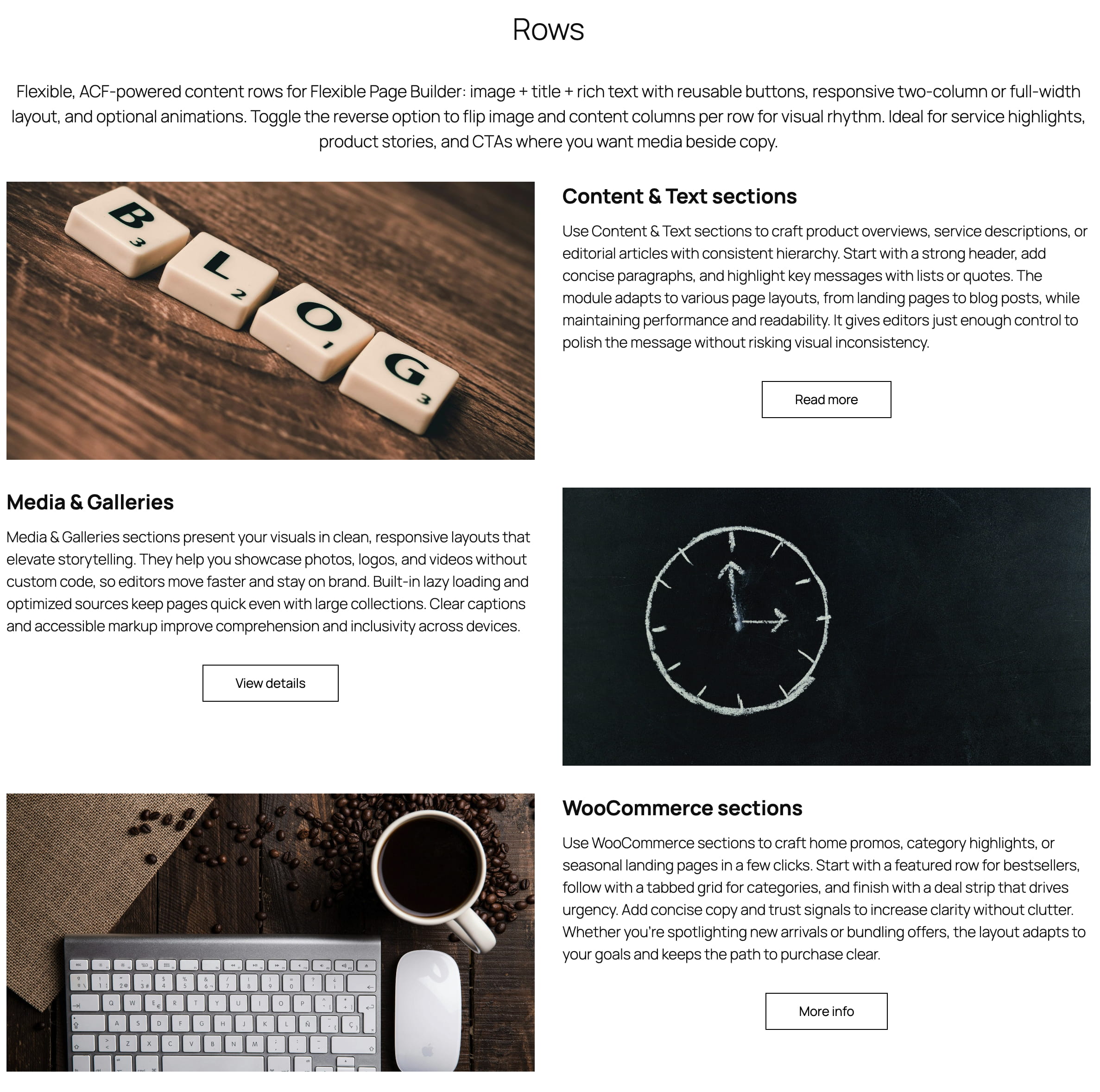
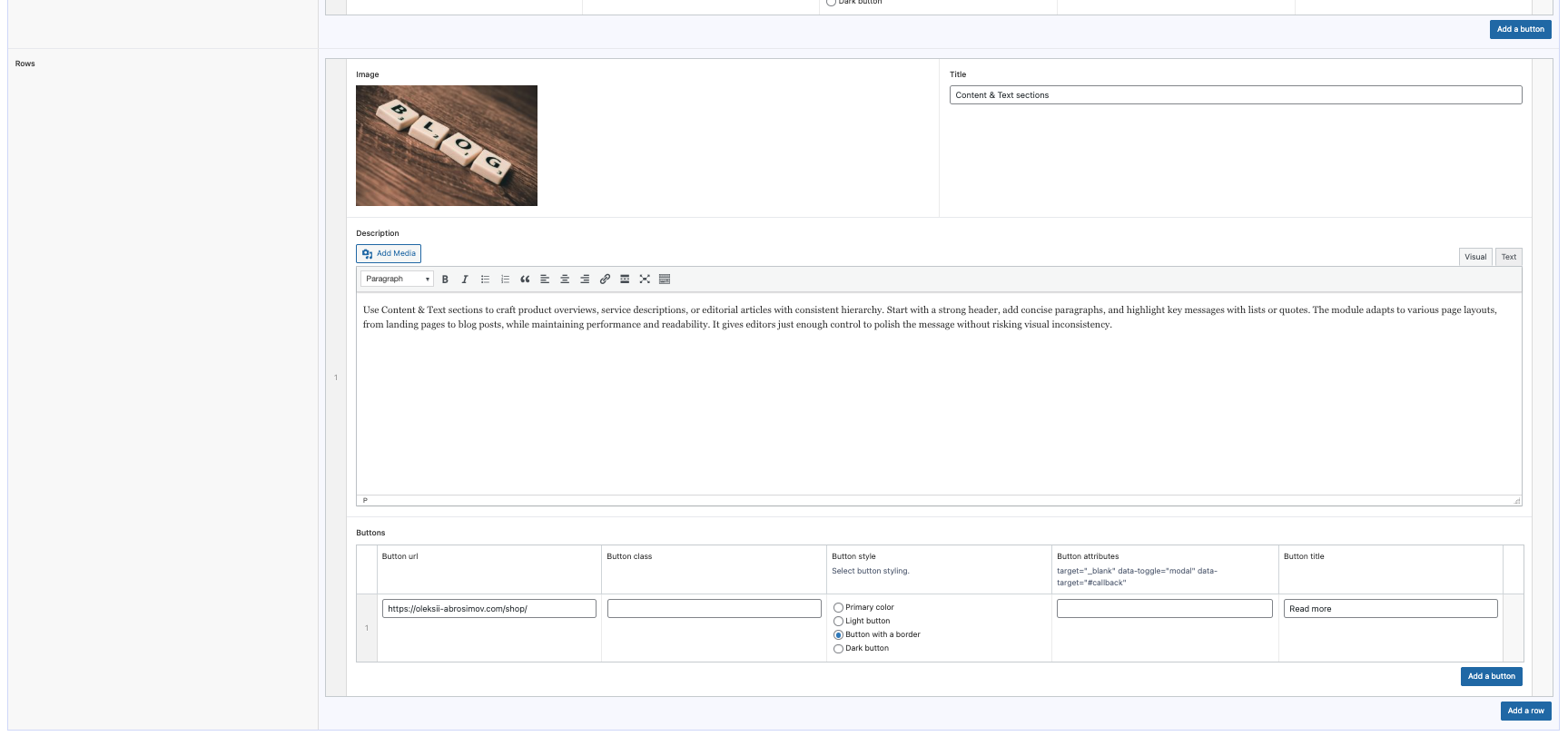
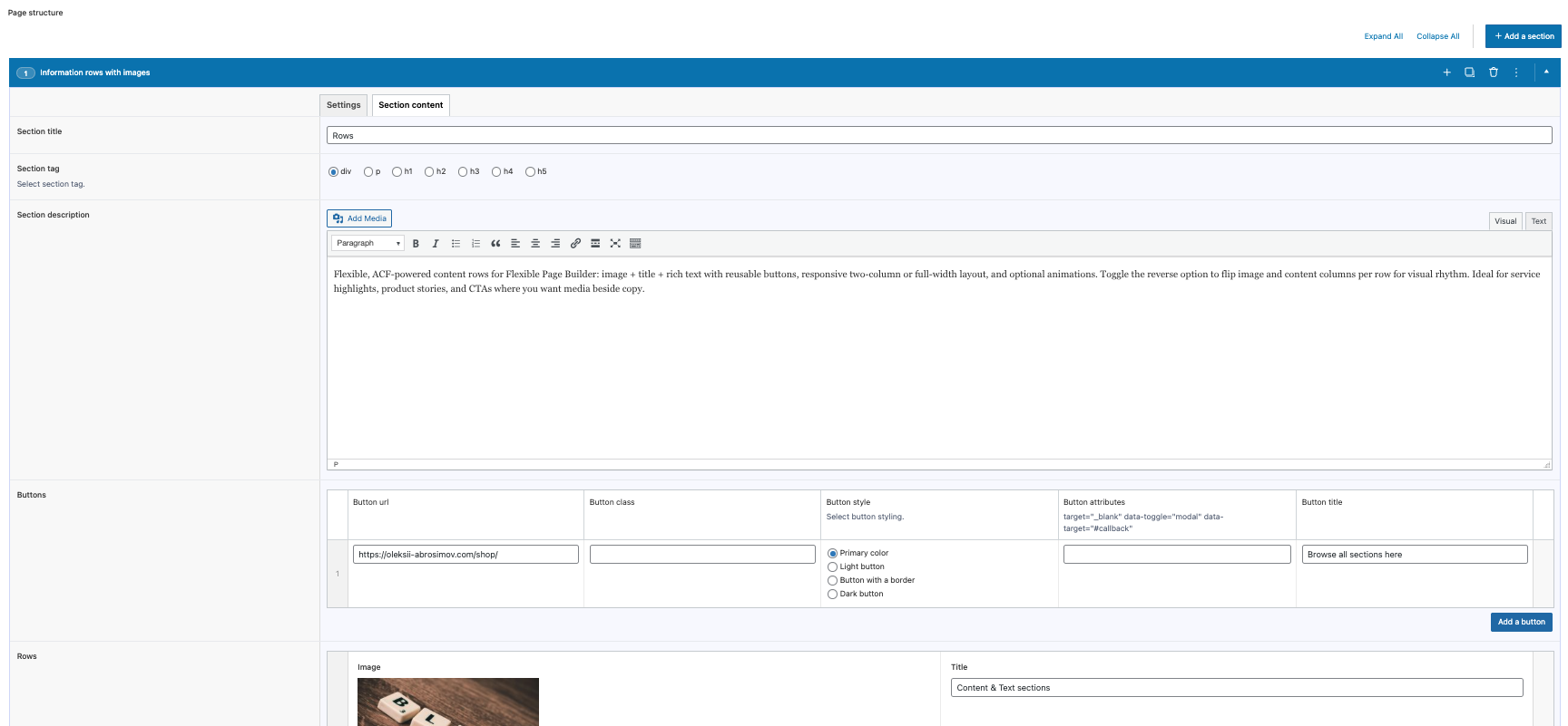
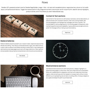
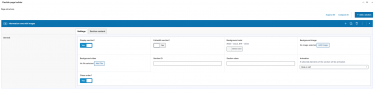
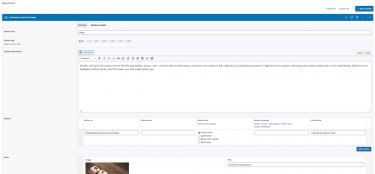
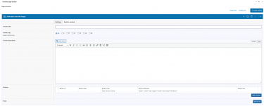
Flexible Rows outputs content rows that can include an image, a title, rich text, and one or more buttons. When both image and text are provided, the layout renders as a two‑column split; otherwise, the available content spans the full width. This module focuses on clean, responsive markup with optional animation classes.
What you can show in the block
- Image area with responsive
<picture>and lazy loading. - Heading (row title) displayed above the description.
- Description (supports HTML/rich text) wrapped with
post_contentstyling. - Buttons (one or multiple) rendered via the module’s reusable button template.
Layout and presentation
- Two‑column layout when image and text/buttons are both present (image column and content column split 50/50 on desktop; stacks on mobile).
- Full‑width layout when only one side (image or content) is provided.
- Buttons are inserted using the shared template so they match the site’s button styles.
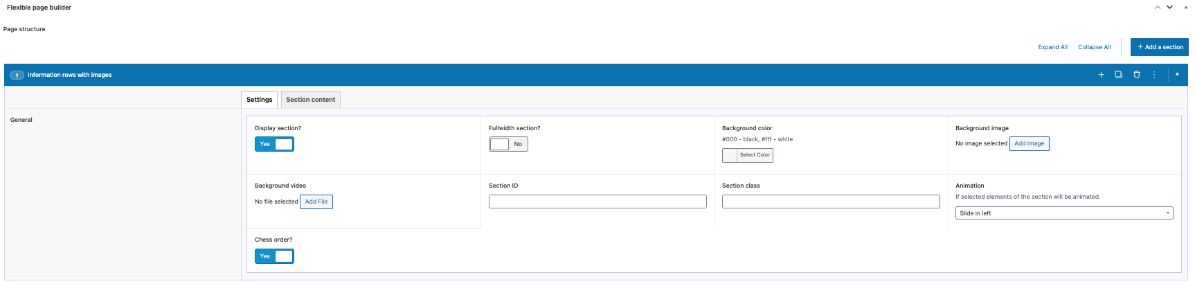
- Animation: optional animation classes can be applied per row via the section settings.
Editor experience
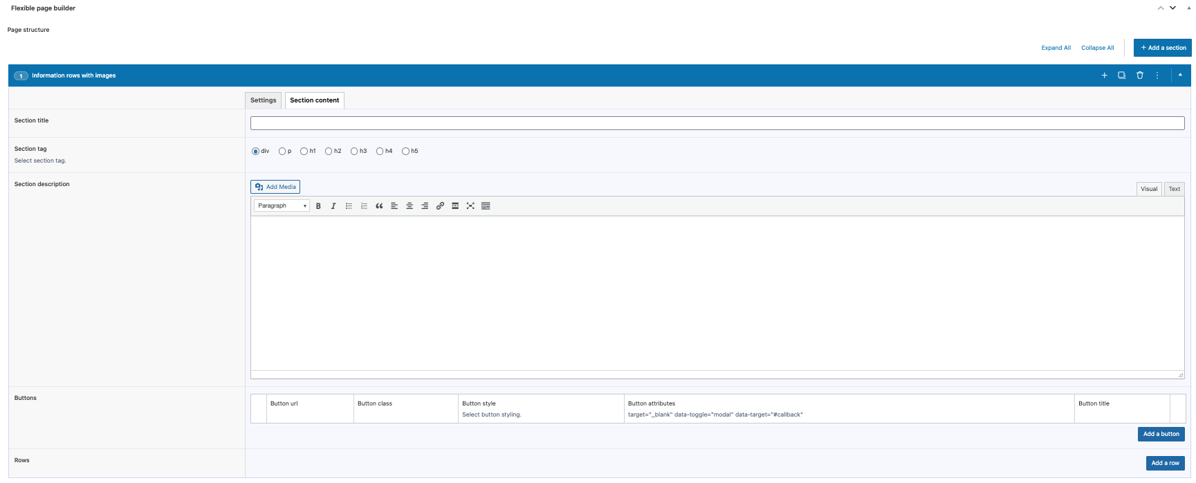
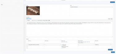
- Manage rows via an ACF repeater: upload image, set title, add description, and configure one or more buttons.
- Reorder rows with drag‑and‑drop; add or remove items without coding.
- Images inherit alt text and are rendered with the plugin’s helper for performance.
- Buttons use the module’s shared template part to keep styling consistent across sections.
What this module does not do (by design)
- Does not enforce a specific grid count beyond the two‑column split; it adapts based on which fields are filled.
- Does not add sliders or carousels – each repeater item renders as a static row.
- Does not fetch content automatically; rows reflect exactly what you enter in ACF.
Typical use cases
- Alternating image + text rows for product or service highlights.
- Promo rows with a call‑to‑action button and supporting copy.
- Feature explainers with visuals and multiple action buttons.