

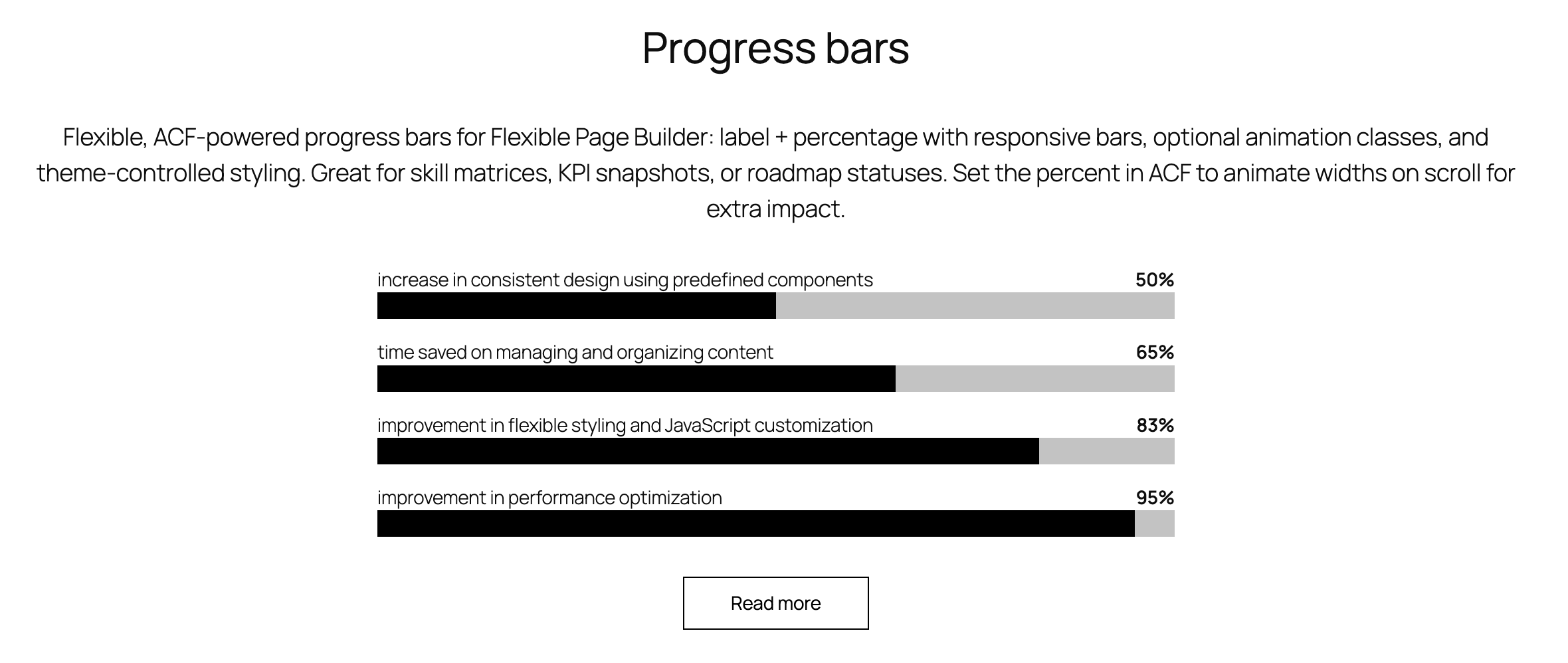
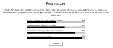
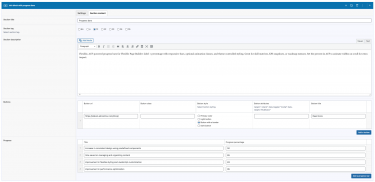
Flexible Progress Bar adds simple, responsive progress bars to your Flexible Page Builder layouts. Each bar shows a label and a percentage value, with the bar width set inline from the provided percent. The module outputs lean markup with optional animation classes; any additional animations or counters can be handled by your theme/site CSS/JS if desired.
What you can show in the block
- Label/title for each progress item (e.g., “Design”, “Uptime”, “Conversion rate”).
- Percentage value (0–100) displayed as text and reflected in the bar width.
Layout and presentation
- Each item includes a top row with the label on the left and the percent on the right.
- The progress bar element sets its width via inline style.
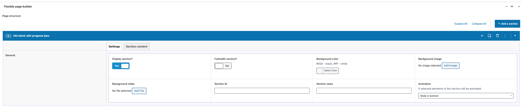
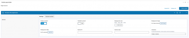
- Optional animation classes can be applied via the section settings to enable CSS‑driven effects.
Editor experience
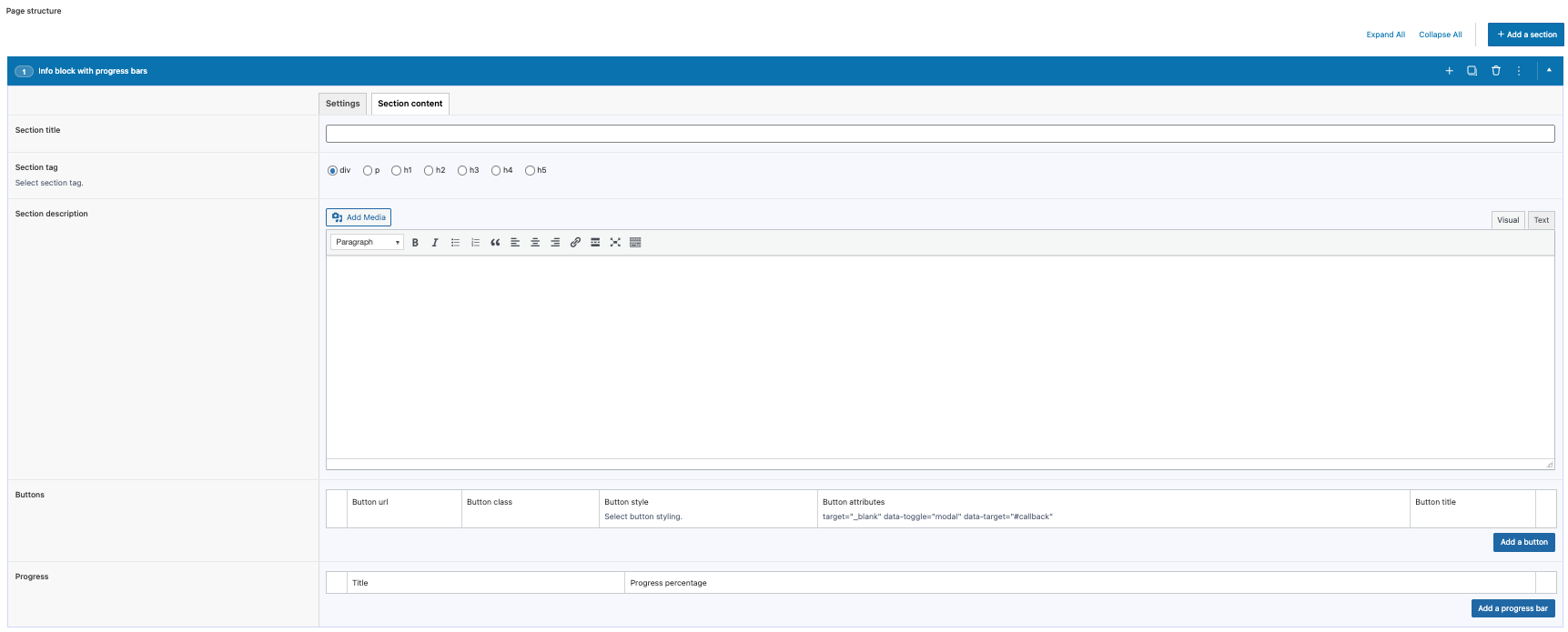
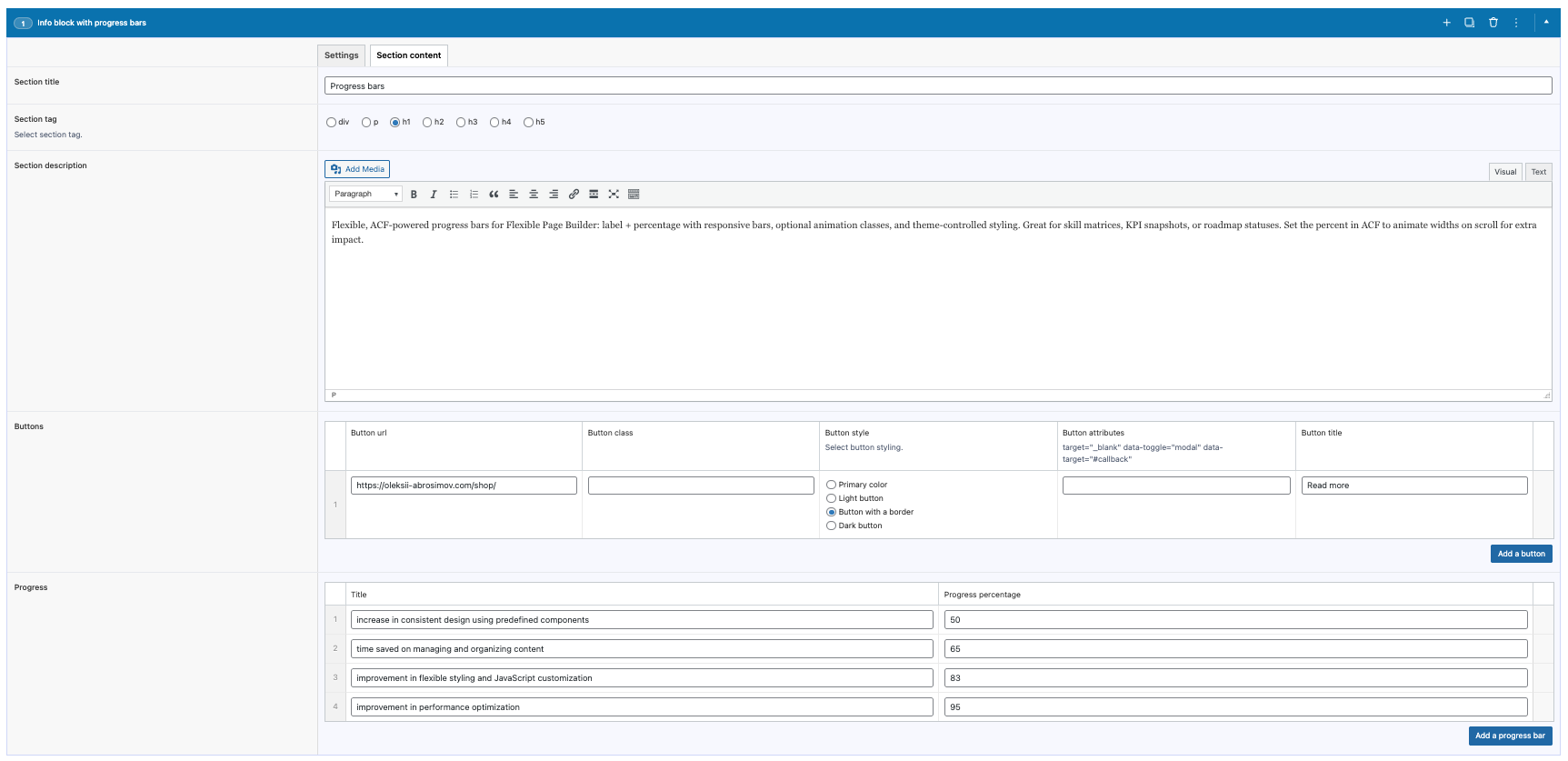
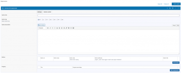
- Manage bars via an ACF repeater: set the label and the percent number.
- Reorder items with drag‑and‑drop; add or remove bars without coding.
Typical use cases
- Skills/competencies sections with percentage indicators.
- Project progress or roadmap completion visuals.
- KPIs where a simple percentage bar communicates status.