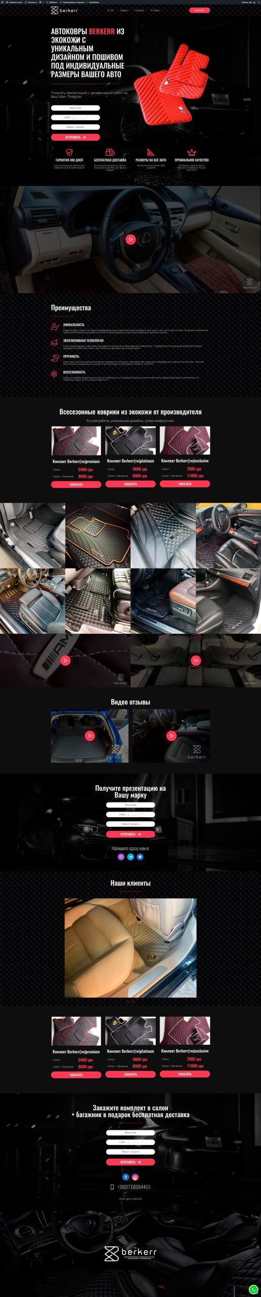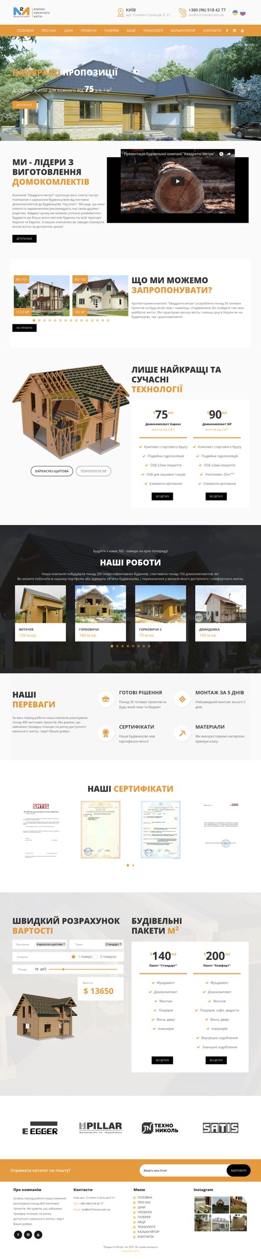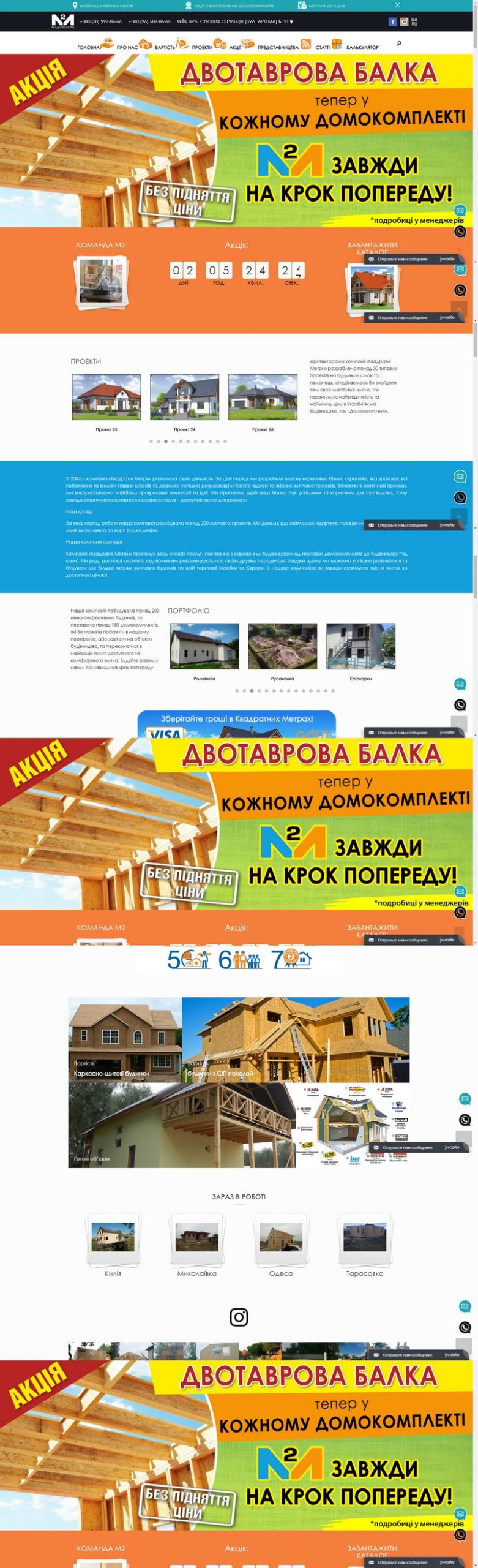

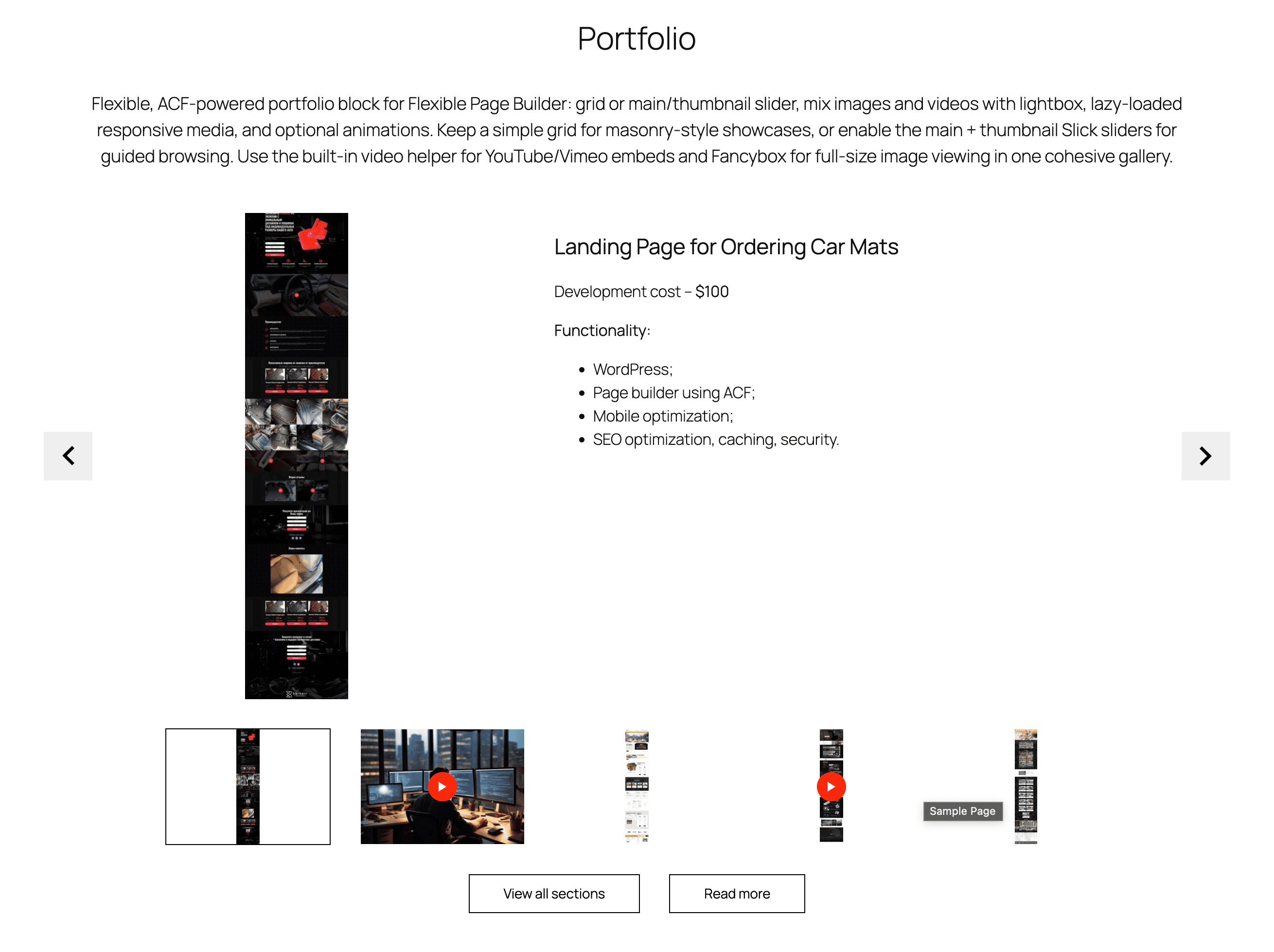
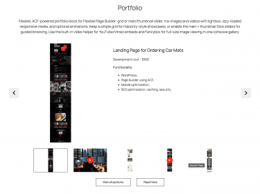
Flexible Portfolio builds a responsive gallery of portfolio items inside your Flexible Page Builder layouts. Each item can be an image (opens in a lightbox) or an embedded video (YouTube/Vimeo/local via the plugin’s video helper). The section supports a main slider with an optional thumbnail slider when the Slick option is enabled; otherwise items render as a responsive grid.
What you can show in the block
- Image item: large thumbnail that opens the full image in a lightbox (via
data-fancyboxgroup). - Video item: supply a video link; the module outputs a poster image and play button using the built‑in video helper.
- Description (rich text allowed) beneath each item.
Layout and presentation
- Grid mode: responsive columns (e.g.,
col-12 col-sm-6 col-md-4) with an optional per‑section item class to control density. - Slider mode: enabling the section’s Slick option items become slides.
- Thumbnail slider: when in slider mode there will be medium‑size thumbnails for navigation.
- Lightbox: image items carry a
data-fancyboxgroup attribute for viewing full‑size images. - Performance: images are rendered with responsive
<picture>markup and lazy loading. - Motion: optional animation classes per item (e.g.,
animated_itemplus the chosen effect).
Editor experience
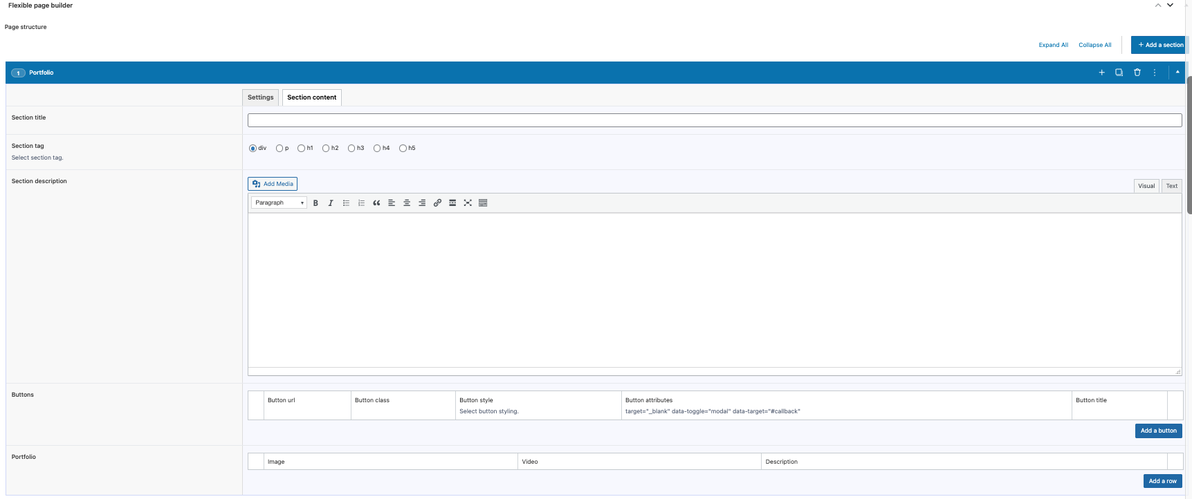
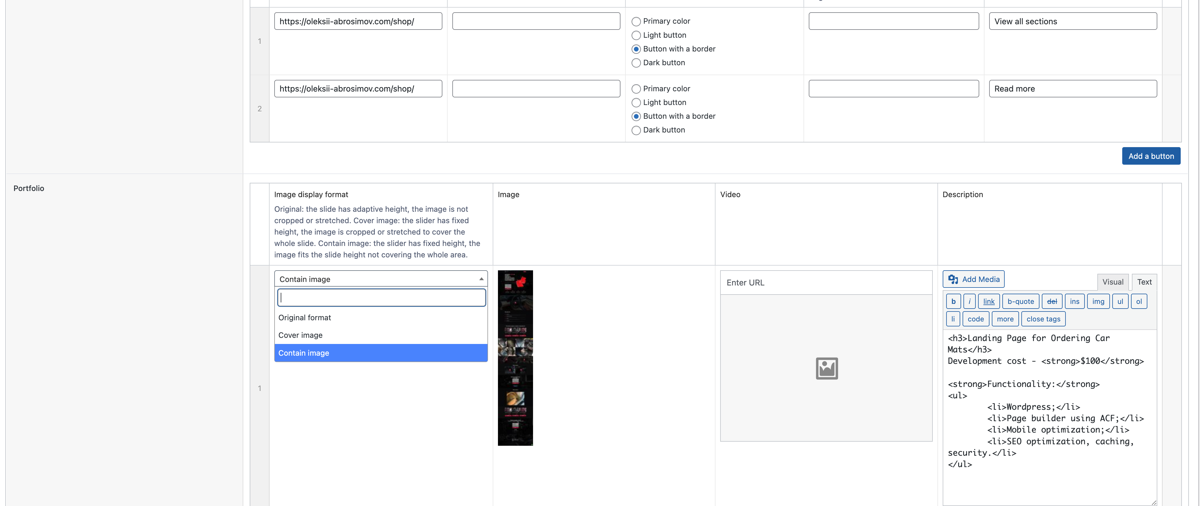
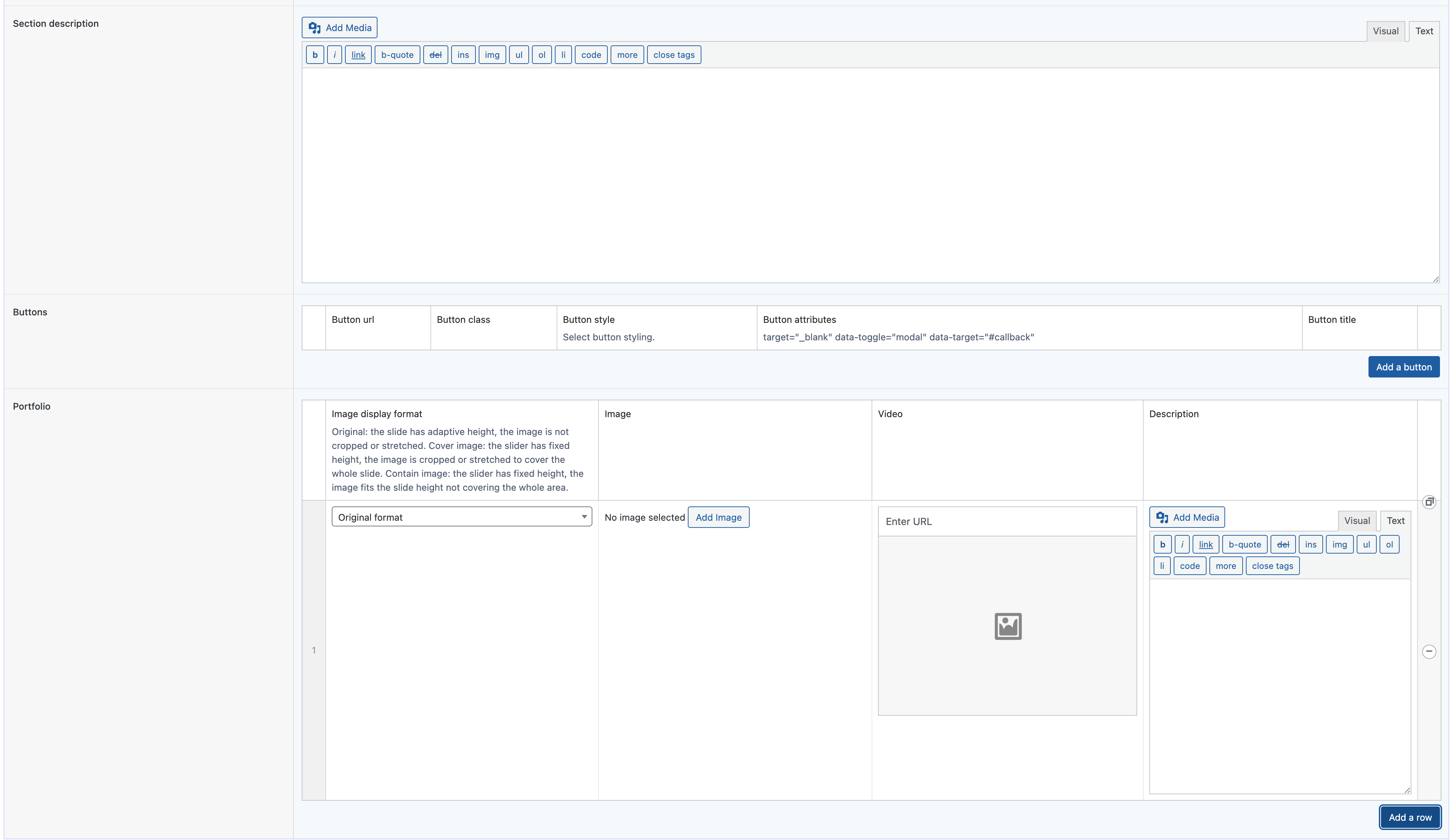
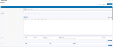
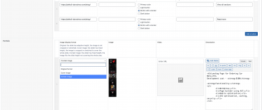
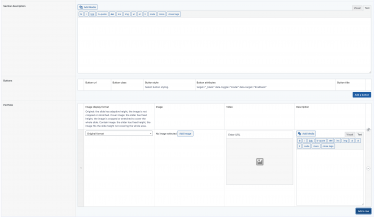
- Manage entries via an ACF repeater: add image, optional video link, and description.
- Drag‑and‑drop to reorder; mix images and videos in one section.
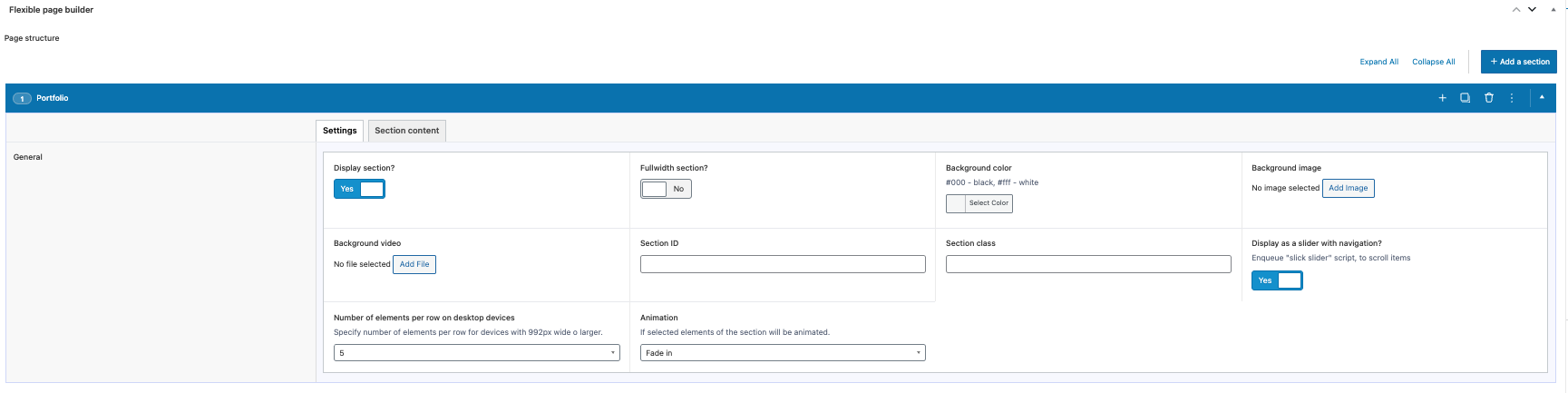
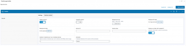
- Toggle grid vs slider in section settings; enable/disable the thumbnail slider automatically with Slick mode.
Typical use cases
- Project/portfolio showcases mixing images and videos.
- Case study galleries with descriptive text.
- Product media sections with main/thumbnail sliders.