

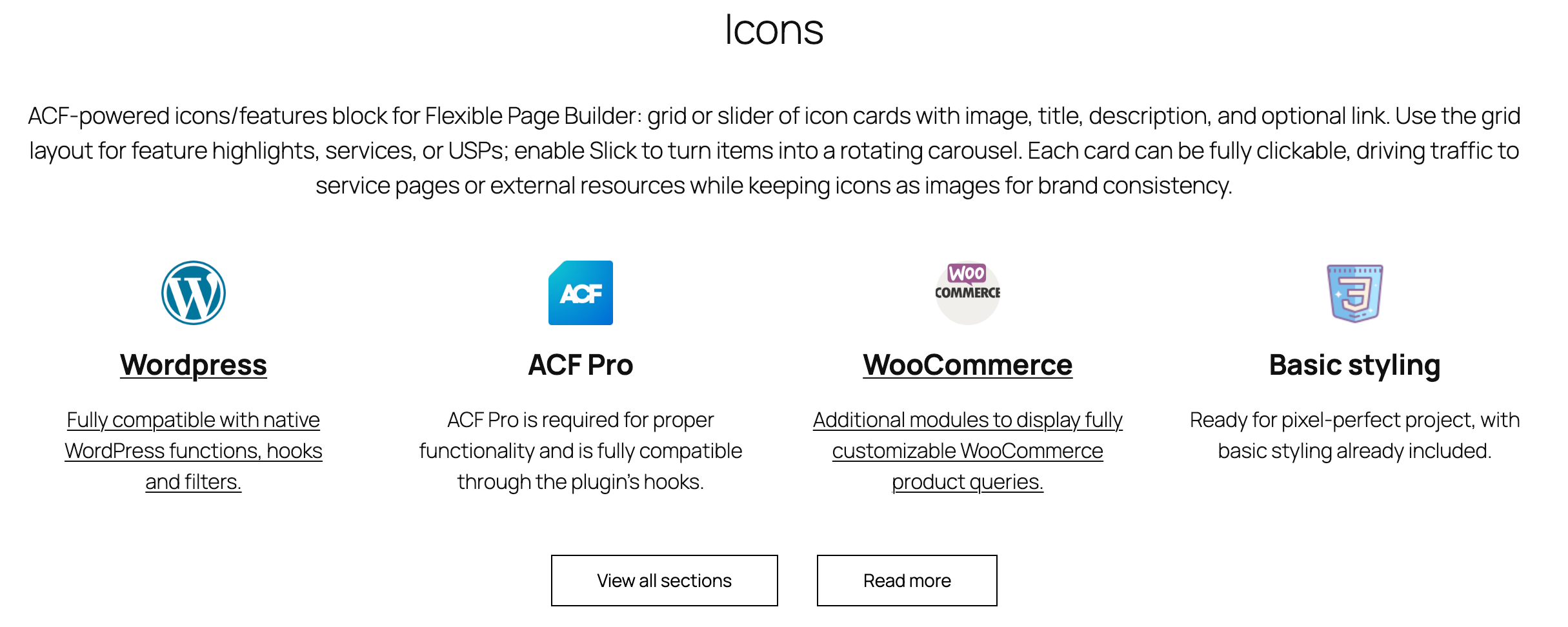
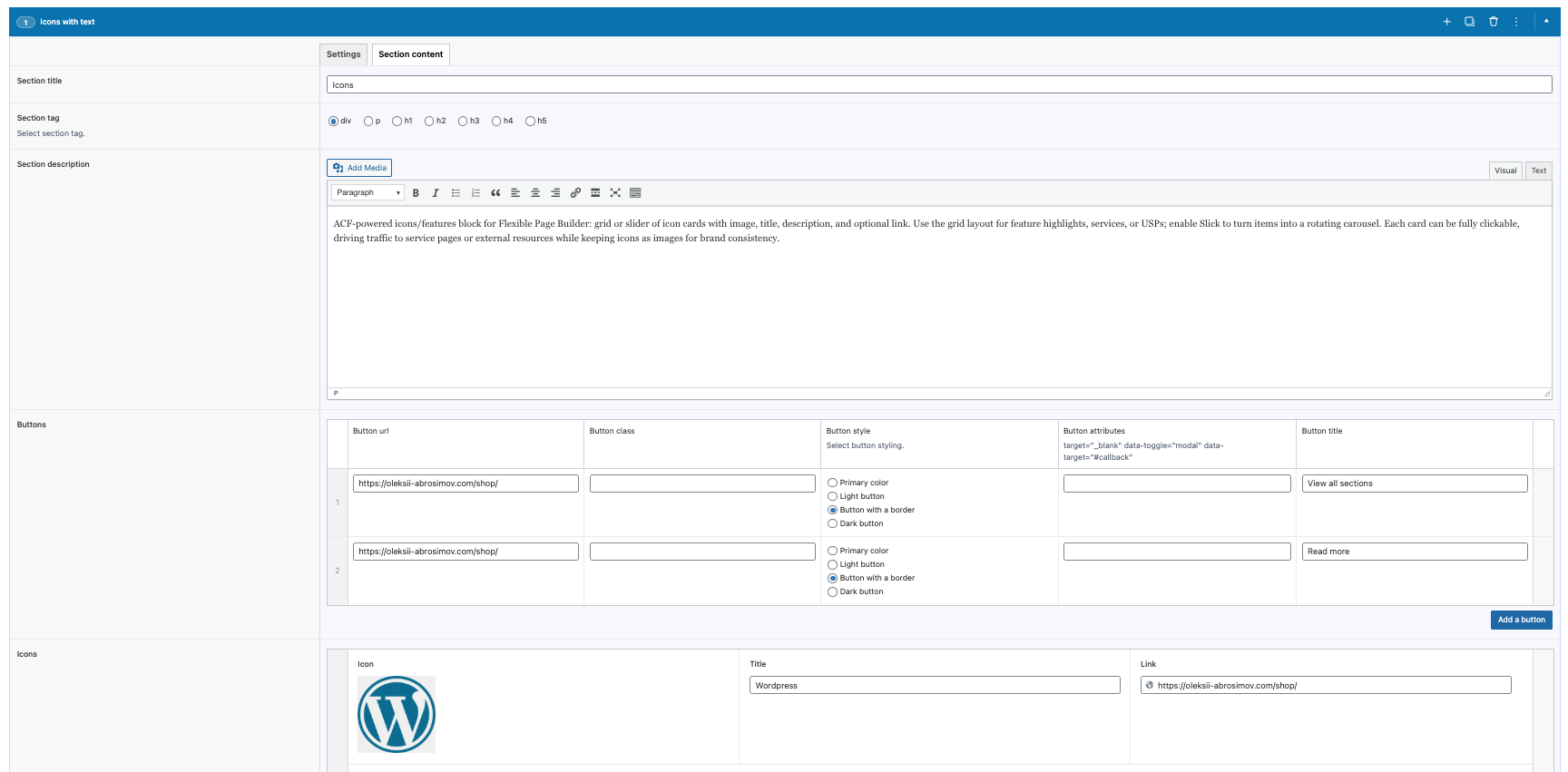
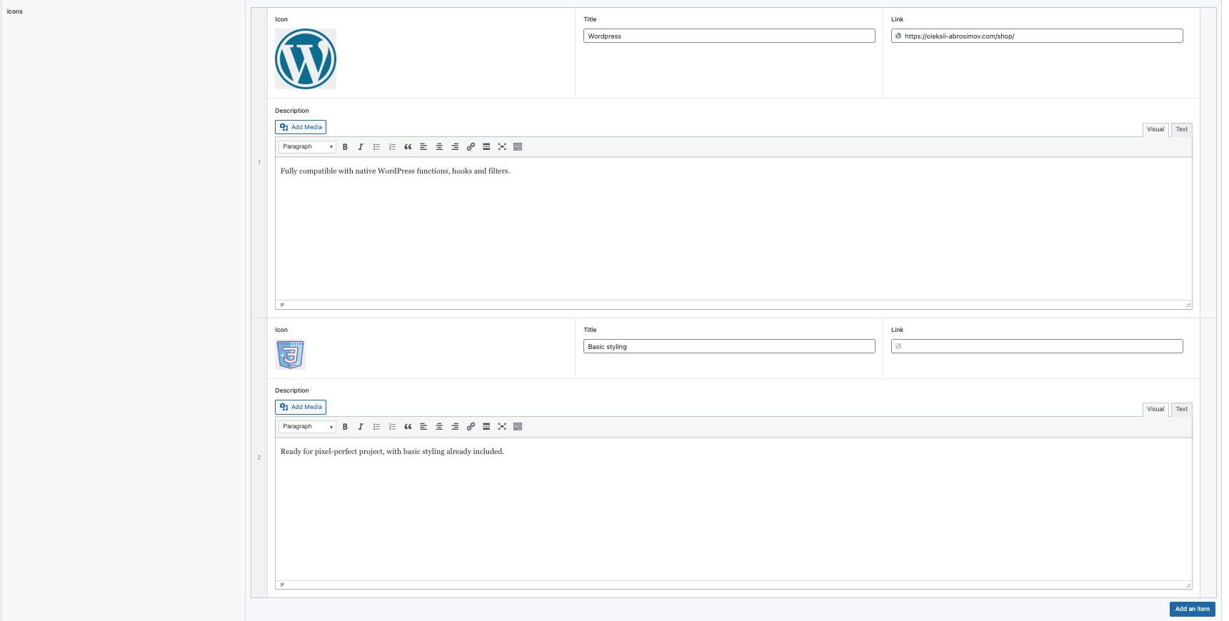
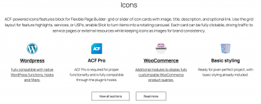
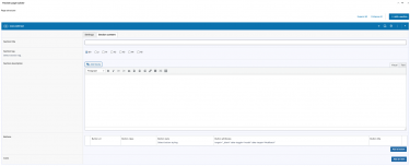
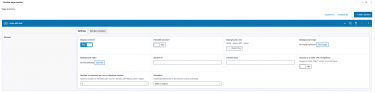
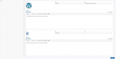
Flexible Icons lets you build a grid or slider of icon/feature cards inside your Flexible Page Builder layouts. Each card can display an icon or image, a title, a short description, and optionally link the whole card to a URL. The module focuses on clean, performant markup and flexible layouts; it does not bundle an icon library – icons are added as images through ACF.
What you can show in the block
- Icon or image (thumbnail) rendered with responsive
<picture>and lazy loading. - Title (headline) per item.
- Description (rich text allowed) under the title.
- Optional link wrapping the entire card; when present, the card becomes a clickable anchor.
Layout and presentation
- Grid mode: responsive columns (e.g.,
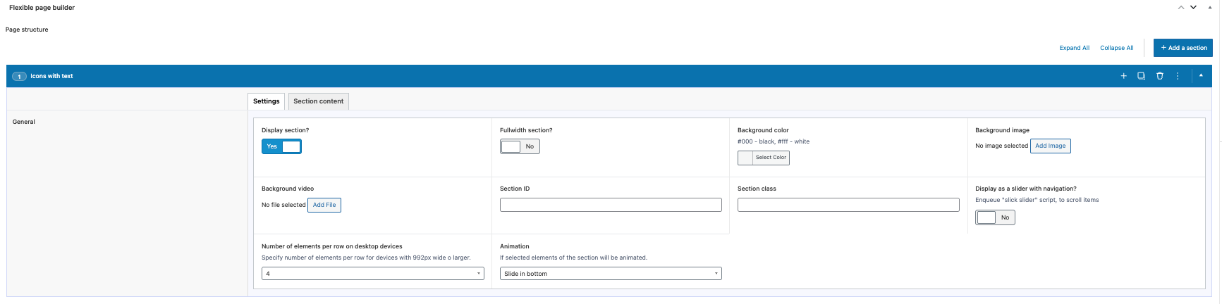
col-12 col-sm-6 col-md-4) with an optional per‑section item class to control columns. - Slider mode: enabling the section’s Slick option items become slides.
- Motion: optional animation classes per item (e.g.,
animated_itemplus the selected animation value). - The entire card area is clickable when a URL is provided; otherwise it renders as a non‑link block.
Editor experience
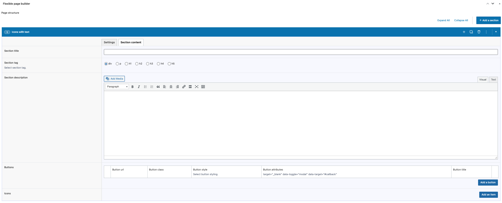
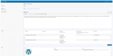
- Manage items via an ACF repeater: upload icon/image, set title, description, and optional link.
- Reorder items with drag‑and‑drop; add or remove cards without coding.
- Control grid density via the section’s item class option; switch to slider by enabling the section’s Slick setting.
Typical use cases
- Features/benefits grids with icons and short descriptions.
- Process steps or value propositions illustrated by pictograms.
- Logo tiles or simple link cards that can switch to a slider on mobile.