


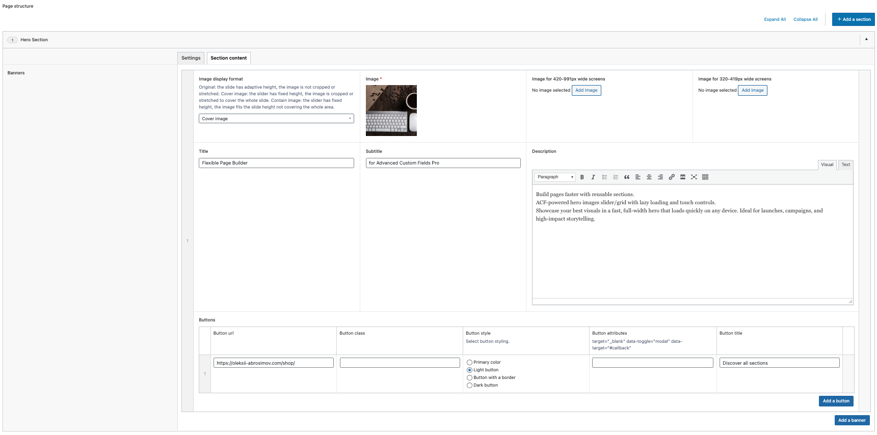

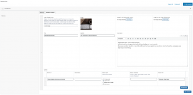
Flexible Hero builds a hero/section slider for your Flexible Page Builder layouts. Each slide can include a background image, a title, a subtitle, rich text, and one or more buttons. Slides support different display formats via a per‑slide image display format class and can
fall back across three image fields to ensure a proper source is available for responsive output.
What you can show in the block
- Hero image with responsive
<picture>output and lazy loading; three image fields are available and used as fallbacks for responsive devices. - Title and Subtitle text areas.
- Description block (HTML/rich text) for supporting copy.
- Buttons (one or multiple) rendered via the shared button template for consistent styling.
Layout and presentation
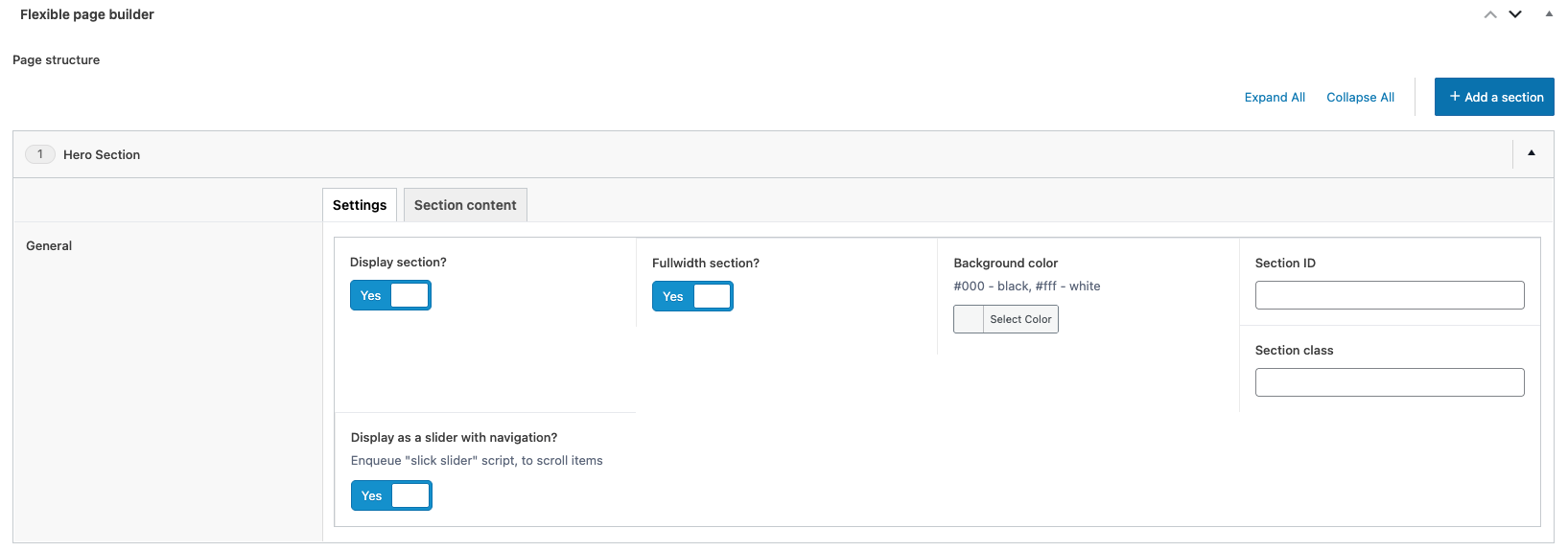
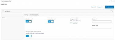
- Slider mode: when the section’s Slick option is enabled, each repeater item is treated as a slide.
- Grid mode: if the Slick option is disabled, slides render as a responsive grid (e.g.,
col-12 col-sm-6 col-md-4plus per‑section item class). - Image display format: a per‑slide class (from the “image display format” select) is applied to the image and item for cover/ratio styling.
- Content container: inner content sits in a centered container/row with a text column, suitable for hero copy and CTAs.
Editor experience
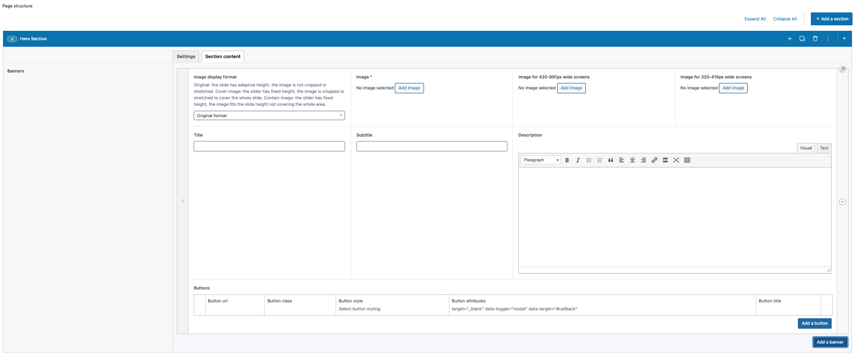
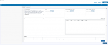
- Manage slides via an ACF repeater: upload images (primary + fallbacks), set title, subtitle, description, and buttons.
- Reorder slides with drag‑and‑drop; add or remove slides without coding.
- Choose the image display format class per slide to control visual presentation.
- Images are rendered via the plugin’s helper as responsive
<picture>with lazy loading.
Typical use cases
- Homepage hero sliders with title, subtitle, and CTA buttons.
- Campaign banners mixing short copy with action buttons.
- Feature highlights where per‑slide image format helps control composition.