
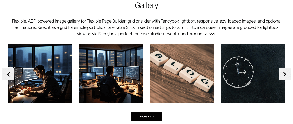

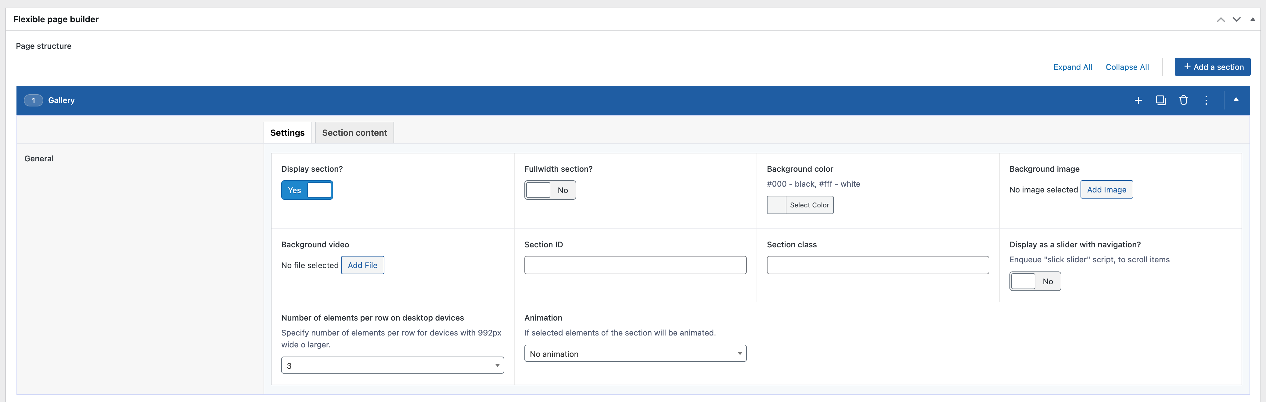
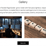

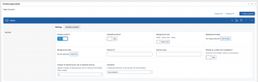
Flexible Gallery creates a responsive image gallery for your Flexible Page Builder layouts. Images are displayed as a grid or a slider (when the section’s Slick option is enabled) and open in a Fancybox lightbox. The module outputs performant markup with lazy‑loaded images and
optional animation classes.
What you can show in the block
- Images from an ACF repeater (each image links to its full‑size version).
- Lightbox viewing via Fancybox groups (images share a
data-fancyboxgallery ID). - Accessible alt text is used for the image and the anchor
titleattribute when available.
Layout and presentation
- Grid mode: responsive columns (e.g.,
col-12 col-sm-6 col-md-4) with optional per‑section item class for column count. - Slider mode: enabling the section’s Slick option items become slides.
- Lightbox: Fancybox CSS/JS are enqueued and auto‑initialized (with
protect: true) for any element withdata-fancybox. - Performance: images are rendered via the plugin’s helper as responsive
<picture>with lazy loading. - Motion: optional animation classes per item (e.g.,
animated_itemwith a selected animation value).
Editor experience
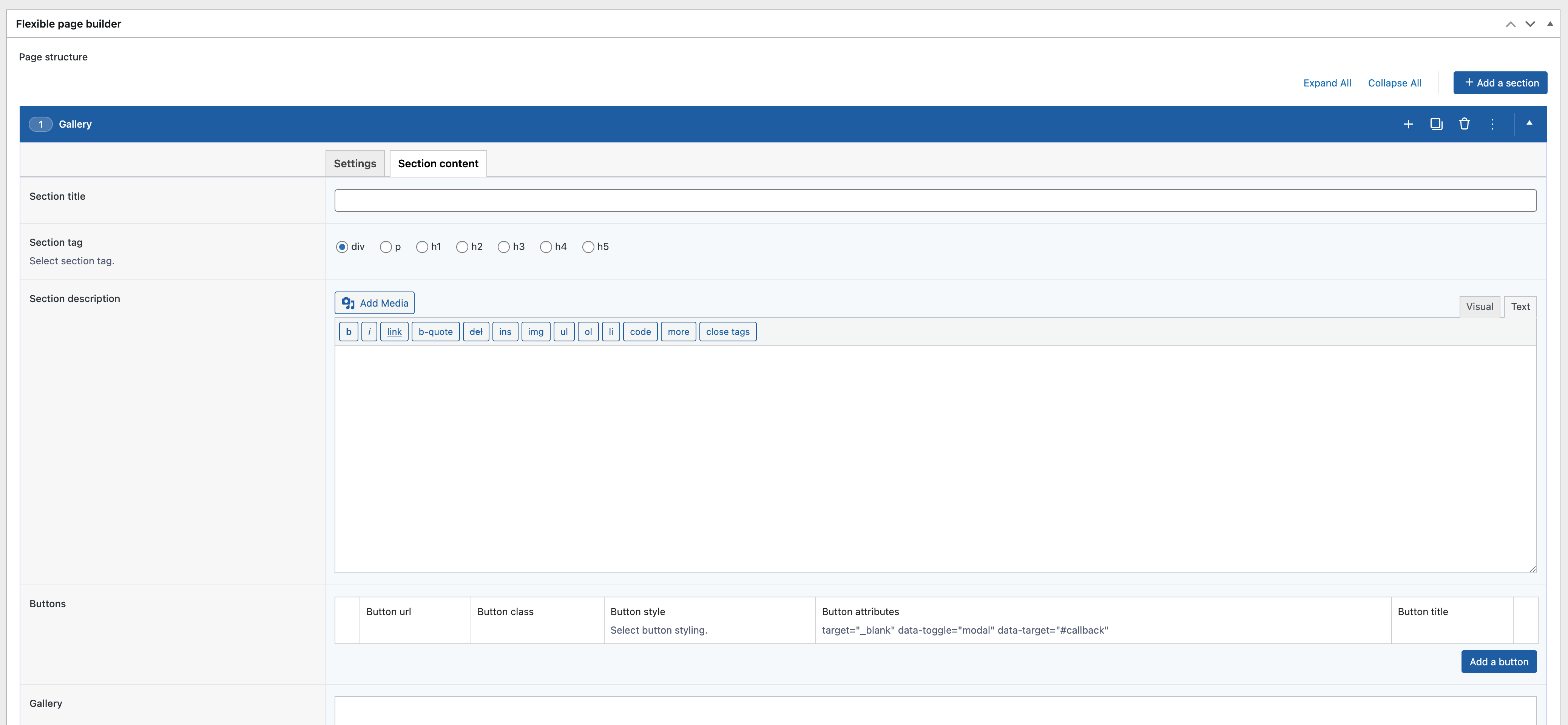
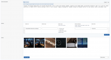
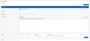
- Manage gallery images via an ACF repeater; reorder with drag‑and‑drop.
- Toggle between grid and slider by switching the section’s Slick setting.
- Alt text is taken from the media item; large size is used for thumbnails, full URL for lightbox.
Typical use cases
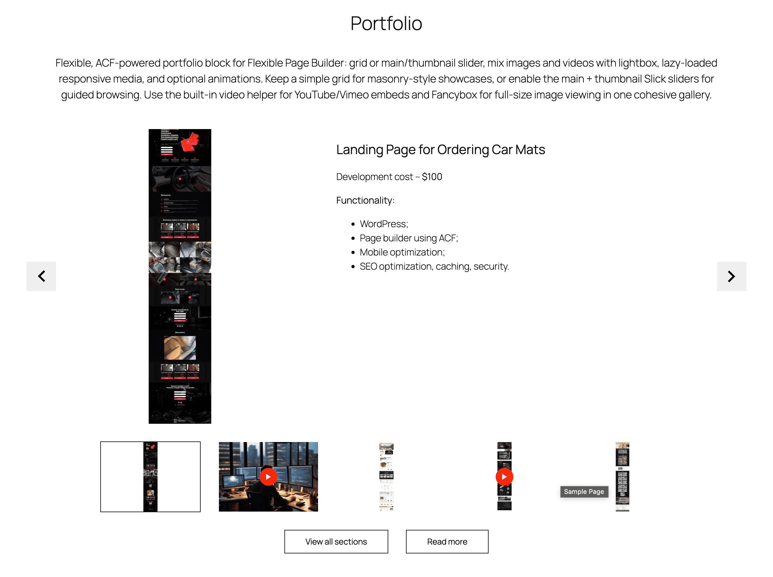
- Project/portfolio galleries with lightbox viewing.
- Event photo grids that switch to sliders on mobile.
- Product detail pages with zoomable images.