

Advantages of Using a Flexible Page Builder for Advanced Custom Fields Pro
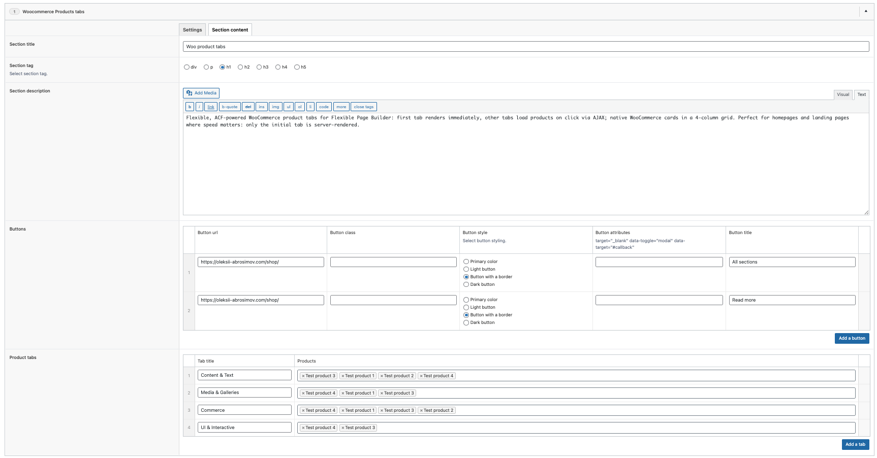
If you build or manage websites in 2026, you’re playing a fast-moving game. Marketers need pages live in hours, not weeks. Designers expect brand-perfect components on every screen. Developers want maintainable, performant code that scales. A flexible page builder for ACF Pro is where these demands converge—a system that lets you assemble pages from reusable, configurable sections while keeping performance, SEO, and brand consistency intact.
In this guide, we’ll unpack the real-world advantages of using a flexible page builder: how it accelerates time-to-market, improves SEO, strengthens design consistency, reduces engineering overhead, and creates a better publishing workflow for teams of any size. We’ll cover practical use cases, best practices, and buying criteria. If you’re ready to try a production-ready solution, explore Flexible Page Builder (3 add-ons included).
What Is a Flexible Page Builder?
A flexible page builder is a modular content system. Instead of assembling pages from scratch, you have a library of sections—hero banners, feature grids, FAQs, testimonials, CTAs, product highlights, pricing tables, and more. Non-technical users can then compose pages by mixing and matching these sections, while developers provide guardrails for accessibility, performance, data integrity, and design fidelity.
Unlike “what-you-see-is-what-you-get” tools that prioritize design freedom at the expense of consistency, a mature flexible builder encodes your brand’s visual language into each section. Content teams move faster, and the underlying code remains clean, maintainable, and scalable.
Key Advantages of Using a Flexible Page Builder
1) Faster Time-to-Market
Marketing campaigns, landing pages, seasonal updates—these shouldn’t require a sprint cycle. With a flexible page builder, pre-built, reusable sections eliminate repetitive work so you can launch in hours, not days.
- Drag-and-configure instead of design-from-scratch.
- Pre-approved patterns reduce review cycles.
- Fewer engineering touchpoints to ship content quickly.
2) Design Consistency Across Pages
Inconsistent spacing, off-brand colors, and ad-hoc layout hacks are common when every page is bespoke. A builder solves this by encapsulating design tokens and spacing rules in the section system.
- Typography, color, spacing, and motion are enforced in code.
- Updates to a component propagate across all instances.
- Global brand refreshes become measured rollouts, not rebuilds.
3) Cleaner, More Maintainable Code
Hard-coded landing pages accumulate debt. A flexible builder promotes single-responsibility components with clear APIs. Developers maintain the sections library rather than tweaking one-off templates scattered across the theme.
- Reusable templates reduce duplication.
- Scoped CSS/JS avoids global conflicts.
- Versioned sections enable safe iteration.
4) SEO Advantages Built-In
SEO is won by semantic structure, performance, and content relevance. A well-designed builder bakes in SEO hygiene so editors don’t have to remember it on every publish.
- Semantic HTML patterns with logical heading hierarchy.
- Image optimization: proper `srcset`, lazy loading, and alt attributes.
- Schema markup (FAQ, Product, Article) where relevant.
- Performance-friendly sections that avoid layout shifts (CLS) and reduce unused JS.
5) Empowered Content Teams
Editors get creative freedom within safe boundaries. They can assemble rich pages, run experiments, localize content, and maintain consistency without writing code.
- Better editor experience with intuitive fields and previews.
- Fewer handoffs and ticket queues.
- Clear separation of content vs. presentation.
6) Performance by Design
Many builders inject heavy JS and third-party bloat. A flexible, developer-first approach keeps pages fast by focusing on lean markup and minimal JS per section.
- Sections load only the assets they need.
- Responsive images and adaptive media.
- Server-side rendering with clean fallbacks.
7) Scalable Governance
As teams grow, governance becomes critical. A builder codifies roles, permissions, and content guidelines directly in the authoring experience.
- Role-based access to sensitive sections.
- Predefined layouts for regulated or brand-critical pages.
- Audit-friendly: changes tracked at the section level.
8) Data Reuse and Content Portability
Structured fields mean you can reuse content across sections, microsites, and campaigns without copy-paste fragmentation.
- Centralized assets and content snippets.
- APIs to republish data to other channels.
- Future-proof schema for migrations and redesigns.
9) Easier Experimentation and A/B Testing
Builders that standardize layout components make it simpler to swap variants, isolate variables, and measure impact accurately.
- Consistent section structures improve test validity.
- Faster iteration cycles with smaller dev dependency.
- Reusable experiment templates for future campaigns.
10) Accessibility by Default
Accessibility shouldn’t be optional. Bake it into sections so every new page inherits accessible patterns—labels, focus states, color contrast, and ARIA where appropriate.
- Keyboard navigability tested once per section.
- Alt text and caption fields enforced.
- Semantic landmarks (header, nav, main, footer) standardized.
11) Multilingual and Localization Support
With structured fields, translation workflows become predictable. Editors translate content, not code.
- Clear separation of translatable vs. structural fields.
- Localized media and region-specific CTAs.
- Language-aware slugs and meta fields.
12) Lower Long-Term Costs
The upfront investment in a flexible builder pays back quickly with reduced maintenance, faster delivery, and fewer costly redesigns.
- Less bespoke code to maintain.
- Fewer regressions during updates.
- Better ROI on design systems and component libraries.
Common Use Cases (with Sections Examples)
Here are high-impact scenarios where a flexible page builder shines, paired with section patterns that ship fast and scale well.
- Product Landing Pages: Hero + Feature Grid + Social Proof + Pricing + FAQ + CTA.
- Content Hubs: Taxonomy filters + Cards + Popular Posts + Newsletter CTA.
- Case Studies: Problem/Solution sections + Metrics + Media Gallery + Quote.
- Local SEO Pages: Location info + Map + Services List + Reviews + Contact.
- Event Pages: Agenda + Speakers + Tickets + Countdown Timer + Logistics.
- Ecommerce PDPs: Gallery + Variants + Specs + Reviews + Related Products.
- Docs/Knowledge Base: ToC + Accordion/FAQ + Code Snippets + Feedback.
Addressing Common Concerns and Misconceptions
“Page builders are slow.”
Many are, but not all. Performance depends on implementation. A flexible, developer-first builder minimizes runtime JS, ships semantic HTML, and loads only what a section needs. The result is Core Web Vitals-friendly pages that rank and convert.
“Editors will make a mess.”
Not if the system is designed well. Safe defaults, limited options, and pre-approved layouts guide editors toward consistent outcomes. Permissions can restrict sensitive sections to trained users.
“We’ll lose custom design.”
A flexible builder doesn’t eliminate custom design – it channels it into a scalable system. You can still create bespoke pages when needed, but your everyday publishing becomes faster and safer.
“It’ll lock us in.”
The opposite can be true. By structuring content and encapsulating presentation in sections, you gain portability. Migrating to a new theme or CMS is easier when your content is clean and structured.
How to Choose the Right Flexible Page Builder
Use this checklist to evaluate your options:
- Semantic HTML output with accessible patterns.
- Performance: minimal JS, lazy loading, responsive images.
- Design system alignment: tokens, spacing, typography baked in.
- Editor experience: intuitive fields, previews, error prevention.
- Extensibility: custom sections, APIs, hooks, versioning.
- Governance: roles/permissions, audit trails, publishing workflows.
- Localization: translatable fields, language-aware SEO.
- Analytics: event hooks per section, A/B testing compatibility.
- Documentation: clear guidelines, examples, and support.
Looking for a proven, production-ready option? Check out Flexible Page Builder (3 add-ons included) – built for performance, accessibility, and content velocity.
Real-World Examples of sections that Move the Needle
Below are section patterns that consistently outperform generic layouts:
- Hero with Proof: Headline + subhead + primary CTA + trust badges or a short stat (e.g., “Used by 5,000+ teams”). Reduces bounce and establishes credibility.
- Feature Trio: Three-card layout highlighting key benefits. Keeps scannability high and reinforces the core value prop.
- Social Proof Strip: Logos + micro-testimonials. Lightweight and powerful above the fold.
- Benefit-led Comparison: Table or tabs comparing your solution vs. alternatives. Clarifies positioning and counters objections.
- Pricing with Toggle: Monthly/annual switch with clear CTAs and feature breakdown. Reduces decision friction.
- FAQ Sections with Schema: Answers common questions and enhances SERP visibility via rich results.
- Sticky CTA or Inline CTA: Contextual prompts throughout long-form content to improve conversion without being intrusive.
Workflow Upgrade: From Tickets to Templates
Consider the old way: a marketer drafts a brief, a designer assembles a mock, a developer implements a bespoke template, QA discovers inconsistencies, and the cycle repeats. With a flexible page builder, templates become living systems. Sections are improved continuously, and the same improvements roll out across the site automatically.
Over time, you build a compound advantage: faster launches, fewer defects, stronger brand integrity, and a site that ages gracefully rather than decaying into a tangle of hotfixes.
Quick Start: Launch with Confidence
- Audit your most common pages and extract recurring sections.
- Define a minimal, reusable section set with clear APIs.
- Integrate design tokens and accessibility from day one.
- Instrument analytics per section for measurable outcomes.
- Document usage guidelines for editors and stakeholders.
- Iterate with versioned releases and controlled rollouts.
Ready to speed up content delivery while improving SEO and performance? Explore Flexible Page Builder (3 add-ons included) and start building pages that convert without sacrificing code quality.
Conclusion: Flexibility Without the Chaos
A flexible page builder brings the best of both worlds: speed and control. Editors get the tools to ship high-quality pages fast. Designers see their system respected and scaled. Developers maintain a clean, performant codebase that improves over time. And the business benefits from better SEO, higher conversion rates, and lower total cost of ownership.
The web will only move faster. Teams that embrace modular content systems today will ship more, ship better, and ship sustainably. If you’re evaluating options, consider the battle-tested
Flexible Page Builder to accelerate your roadmap.
Next step: Build your first page in minutes with the right building sections. Get Flexible Page Builder now.